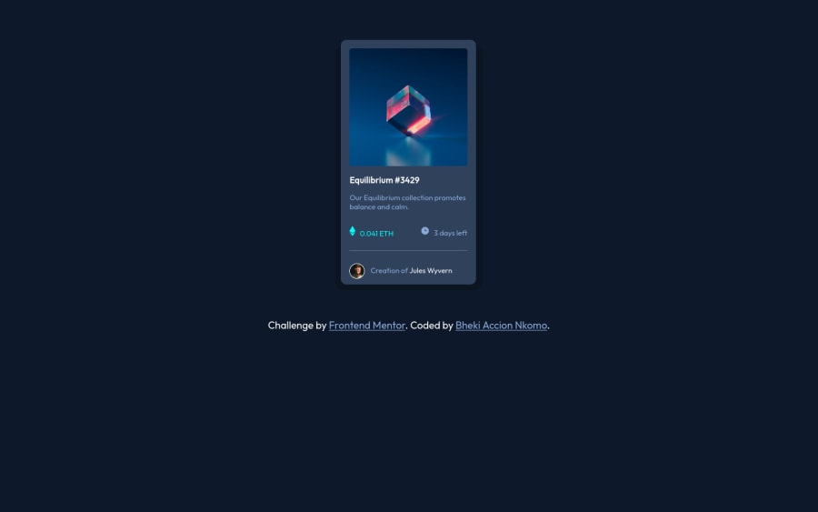
Design comparison
Solution retrospective
Im kind of struggling to make this card respond to viewer point so it can remain at the center of the screen, anyone with a suggestion? Im also noticing that my icons for Ethereum and time do not seam to be at the same line with the p tags that follow, l had the same issue with the profile picture but l manages to reduce it with a negative margin. What could be the cause here?
Community feedback
- @ajlsdntPosted over 2 years ago
Hi Bheki! This honestly looks great, congrats!
An input for me that hopefully can help you. -centering the content. The method that works for me every time is setting the height of your <body> to 100vh (which means it'll take up the full-screen height of viewer devices) and using flexbox (display: flexbox; justify-content: center; align-items: center;)
Marked as helpful0@BhekiAccionPosted over 2 years ago@ajlsdnt hi, Thanks, l often use vh, vw and percentages so that my projects can be responsive automatically, but none seem to be working on this one. l will however try aligning my future works with flexbox and grid and see how it goes. I appreciate your feedback.
0
Please log in to post a comment
Log in with GitHubJoin our Discord community
Join thousands of Frontend Mentor community members taking the challenges, sharing resources, helping each other, and chatting about all things front-end!
Join our Discord
