Submitted about 1 year ago
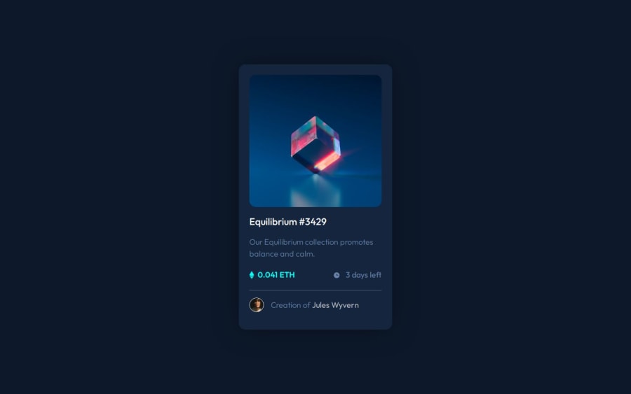
NFT Card Preview no Figma
#web-components#styled-components
@grgrnkoo
Design comparison
SolutionDesign
Solution retrospective
One more project was made by me. I'm getting closer to my goal of completing all free tasks on Frontend Mentor
Challenges I faced in this project:
-
figcaption had 2% more height than image. Ended up adding a flex attribute to a figure box. Probably adding a cover property to an image would've led to the same result.
-
Also spent some time experimenting with replacing figcaption with a common div. No difference at all. Just semantic
-
Relative position of figure. Took a time to realize how to make an absolute figcaption fit into a figure
Would like to see your reviews!
Community feedback
Please log in to post a comment
Log in with GitHubJoin our Discord community
Join thousands of Frontend Mentor community members taking the challenges, sharing resources, helping each other, and chatting about all things front-end!
Join our Discord
