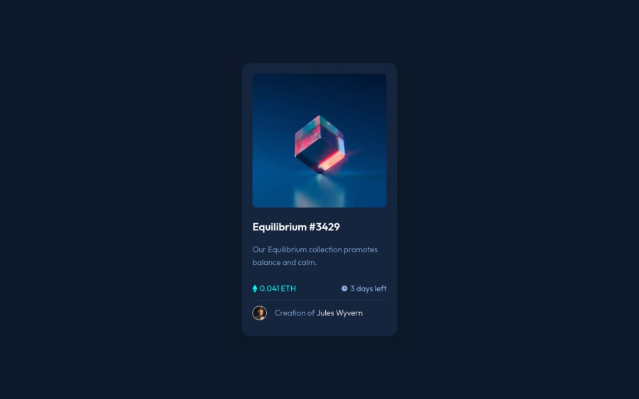
NFT Card Preview Component | HTML CSS Sass
Design comparison
Solution retrospective
Hello Everyone! 👋
This challenge looks simple, yet still challenging! Especially when making it accessible. 😅
Two things that I learned:
- WebP Image
- Creating the overlay with pseudo-element and shorthand background property.
Check the README.md to get more info!
Now for the questions:
- If you try using screen reader on my website, can you understand the page content?
- Can you navigate through this website comfortably using your keyboard (
TabandEnter)? - Do I have to wrap the text inside a
figcaptionelement withptag? For example the text inside ablockquoteelement should be wrapped withptag according to hail2u/html-best-practices repo.
Any questions on the technique that I'm using are very welcome! 🙌
Also if you want me to give my feedback on your solution to this challenge, feel free to give me the link to the community feedback! I will be glad to help you too!
Thanks!
Community feedback
- @EmmiecodesPosted over 2 years ago
Hello Vanza,
I was doing the order-summary challenge and was trying to focus more on accesibility doing so, and I came across the issue of having to use a div for the subscription plan and price part so I started googling the use of the role attribute and a ton of other things and came across your page that way. I saw you also used a div for the same part as I did, without adding a role attribute to it for screenreader users to make sense of the div. (I had no clue what role to add when I looked them up)
Afterwards I went looking at your NFT card solution which did help me out with realizing I could use the figure and figcaption with flex styling too, and aside from that there are some nice accesibility features you have, I had not thought about or seen before, like adding the abbrevation (before I had no clue what ETH was either) and the custom focus effect on your order summary. I like how you normalize accesibility in your code and the questions you ask on here, that should be an example for all. I was wondering though why you chose to use UL's for the currency and days left part instead of divs and why you didn't do so for the subscription info/costs in the order summary? And if you deliberately chose to keep your alt="" descriptions short? It makes me think about how meaningful those images really are to screenreader users or non screenreader users wanting to buy crypto and wonder if my alt descriptions are too long for this context. (Eg: white boy with brown hair, bangs and cream colored shirt)
Marked as helpful0@vanzasetiaPosted over 2 years ago@Emmiecodes
Hey there! Thank you for the comment! 🙂
I made some changes to the HTML. So, I decided to use
pelement instead of a list element. I think it doesn't make sense for those content to be rendered as a list.For the alternative text of the avatar, I recommend using the author's name. It is an important thing that users need to know rather than the styling of the avatar.
1 - P@brodiewebdtPosted over 3 years ago
This looks very good. I have gotten to the point that I look at spacing and alignment on every site I go to. This really looks good. The TAB key works here.
Marked as helpful0@vanzasetiaPosted over 3 years ago@brodiewebdt 😊 Thanks for your compliment! Glad to know that you can navigate through the website using keyboard!
1 - @al3xbackPosted over 3 years ago
Hi Vanza,
I believe there is an inconsistency in your css, esp using single colon on pseudo element.
img:after {
    ...
}
Marked as helpful0@vanzasetiaPosted over 3 years ago@al3xback Yeah, I have added one more colon to it. Thanks for pointing that!
1
Please log in to post a comment
Log in with GitHubJoin our Discord community
Join thousands of Frontend Mentor community members taking the challenges, sharing resources, helping each other, and chatting about all things front-end!
Join our Discord
