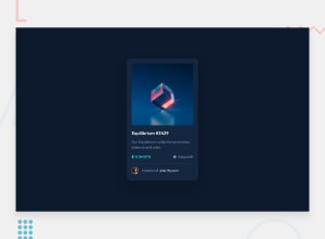
Design comparison
Community feedback
- @correlucasPosted about 2 years ago
👾Hello @JonathanSamael, Congratulations on completing this challenge!
I’ve few suggestions for you that you can consider adding to your code:
1.Replace the
<h2>containing the main title with<h1>note that this title is the main heading for this page and every page needs one h1 to show which is the most important heading. Use the sequence h1 h2 h3 h4 h5 to show the hierarchy of your titles in the level of importance, never jump a level.2.I saw that for some properties you’ve used
remand for otherspx. In this case, it is better to use only one kind of unit to have a better organization for your code.relative unitsasremoremhave a better fit if you want your site more accessible between different screen sizes and devices.REMandEMdoes not just apply to font size, but to all sizes as well.3.Add a margin of around
margin: 20pxto avoid the card touching the screen edges while it scales down.4.👨💻Here's my solution for this challenge if you wants to see how I build it: https://www.frontendmentor.io/solutions/nft-preview-card-vanilla-css-custom-design-and-hover-effects-b8D1k9PDmX
✌️ I hope this helps you and happy coding!
Marked as helpful1
Please log in to post a comment
Log in with GitHubJoin our Discord community
Join thousands of Frontend Mentor community members taking the challenges, sharing resources, helping each other, and chatting about all things front-end!
Join our Discord
