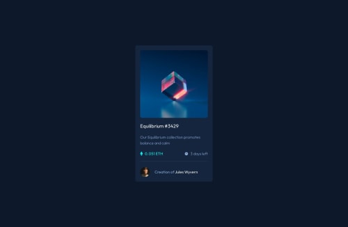
Submitted over 2 years agoA solution to the NFT preview card component challenge
NFT Card Page
vite, react
@garbiru

Solution retrospective
This time I think I did good.
Didn't have to do any responsiveness, didn't see where it would be needed.
What I usually find difficult is working with widths, specially when I'm using something like a display grid and place items center, this time I used max-width on the card, don't know if it's the best approach, maybe is there something better?
Code
Loading...
Please log in to post a comment
Log in with GitHubCommunity feedback
No feedback yet. Be the first to give feedback on Gabriel Garcia's solution.
Join our Discord community
Join thousands of Frontend Mentor community members taking the challenges, sharing resources, helping each other, and chatting about all things front-end!
Join our Discord