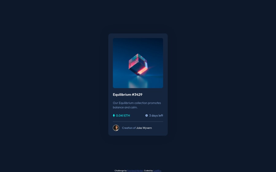
NFT Card Hover Overlay Using Vanilla CSS Pseudo-elements
Design comparison
Solution retrospective
I'm not sure if I was supposed to hardcode the width
& height
values of the different sections of the card.
My Questions
-
Was my
:hover
overlay the best practice in the industry? -
How do I automatically size the
::after
element's background to match the original element with 100% accuracy? -
Is it best practice to use
background-size: contain
for SVG images? -
How do I recolor SVGs using CSS without using CSS masks or editing the
.svg
path
directly?
Community feedback
- @PipouwPieuwPosted over 1 year ago
Hello @Luzefiru and congratulations for completing this challenge!
To answer your questions :
1. Your hover overlay method is fine! However I would change a few things :
- Switch the :before and :after to make the eye icon pass in front of the background. Or you could set
z-index: 1
to the :before. - Try using a CSS transition to make the effect smoother. You could also set a transition to the title and author's name hover effects.
- Also, this is not about the hover effect but I wouldn't set the product image as a background. It's not a decorative image here, it would be good to make it accessible to screen readers by using an <img> tag and providing an alt attribute to describe it.
2. To make an absolute element take the full size of its parent, first make the parent's position
relative
. An absolute element's position is calculated based on its closestrelative
ancestor. Then you can make the element match its parent's boundaries like so :.element { position: absolute; top: 0; right: 0; bottom: 0; left: 0; }
3. I wouldn't say it's a bad thing to use
background-size: contain
, as long as the icon displays correctly. Here again I would have used an <img> tag but as it is a decorative icon, it's fine this way I guess. :)4. I don't think you can change the colors of a SVG with CSS if you insert them as background image or even with an <img> tag. However you can do so by inserting the raw SVG inside your HTML, then you'd have access to the elements inside. But I really don't know if it's a good thing to do. Another way to do this is by converting your SVGs into a webfont. The icons can then be inserted as characters and you can change their color and size using CSS. This process is a bit complex though. For beginners, I'd say your method is really fine. :)
I hope my comment was helpful. You did a good job, keep going!
Marked as helpful1@LuzefiruPosted over 1 year ago@PipouwPieuw I totally forgot about
z-index
. Thank you for the tips!Also dang, that's a huge bummer that you can't change the color of a
.svg
with CSS. There must be some way to manipulate them programmatically without having to resolve to using an npm library.I'll definitely use
transition
animations to make my UI more smoother during my next solution. This was the first time I did something like that eye icon colored overlay feature, so I hope I can perfect the formula in future iterations.Thanks again!
0 - Switch the :before and :after to make the eye icon pass in front of the background. Or you could set
- @0xabdulkhaliqPosted over 1 year ago
Hello there 👋. Congratulations on successfully completing the challenge! 🎉
- I have other recommendations regarding your code that I believe will be of great interest to you.
HTML 🏷️:
- This solution generates accessibility error reports due to
non-semantic
markup, which lack landmark for a webpage
- So fix it by replacing the element
<div class="attribution">
the with semantic element<footer>
in yourindex.html
file to improve accessibility and organization of your page.
- What is meant by landmark ?, They used to define major sections of your page instead of relying on generic elements like
- They convey the structure of your page. For example, The
<footer>
typically contains information about the author of the section, copyright data or links to related documents.
HEADINGS ⚠️:
- And, this solution has also generated accessibility error report due to lack of level-one heading
<h1>
- Every site must want at least one
h1
element identifying and describing the main content of the page.
- An
h1
heading provides an important navigation point for users of assistive technologies, allowing them to easily find the main content of the page.
- So we want to add a level-one heading to improve accessibility by reading aloud the heading by screen readers, you can achieve this by adding a
sr-only
class to hide it from visual users (it will be useful for visually impaired users)
I hope you find this helpful 😄 Above all, the solution you submitted is great !
Happy coding!
0
Please log in to post a comment
Log in with GitHubJoin our Discord community
Join thousands of Frontend Mentor community members taking the challenges, sharing resources, helping each other, and chatting about all things front-end!
Join our Discord