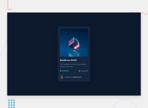
Design comparison
Solution retrospective
So one major problem- Git is really confusing- I've uploaded it off of VS code however the stylesheet doesn't seem to be linking now I've put it in GIT- can anyone help me understand what I've done wrong?
Actual CSS roadblocks I hit:
- the p elements inside my wrapper div would create their own margin- I removed the margin using the * selector but they still created a double height margin
- the eye that appears when hovering over the main image- I couldn't work out how to make it have more opacity than the color overlay
- mobile version- it looks different in chrome and firefox I'm not sure why. Chrome it is more zoomed- i think bc of the em values i have used?
Overall i am really happy with how this went- if anyone can give me some feedback on my issues i would appreciate that so much! especially my GIT one!
Community feedback
- @grace-snowPosted almost 3 years ago
Nice job on this. The html is good, just make sure you format it so all the code indentation is consistent and neat (easier to read and easier to spot bugs)
Some of the sizes on this look a little off, like the font size on the price and time left, and the cards max width when I view on mobile landscape or view your preview above. One max width in rem on this should be enough, I'm not sure there is any need for a media query on this challenge
Marked as helpful1@Callietron300Posted almost 3 years ago@grace-snow thanks grace, normally I'm good with indentations I must of missed something, I will go through and check!
I was wondering about using rem in my last project thank you, I'll have a play later.
If it's not too much to ask with the font sizes did I do the right thing? I'm still trying to understand what's best practice for setting up default sizes. I will try find an article on it I think
0@grace-snowPosted almost 3 years ago@Callietron300 rather than sizing font size on a wildcard I would set it on the body. Then change other font sizes as needed on elements like the heading, wrapper divs and card footer. Font size would be in rems, just as you've done
Until you've got Pro membership though, font sizes are always going to be guess work. I wouldn't worry about getting them exactly right on practice projects when you don't have access to the design files
Marked as helpful0@Callietron300Posted almost 3 years ago@grace-snow sweet, I set them out side the body and used em on the defaults I think, and had originally used px in my * styling. That's alot it's really appreciated
0 - @vanzasetiaPosted almost 3 years ago
Hello, Callie! 👋
Based on your GitHub repo, the
style.cssfile is in the root folder. This means you only need to use./instead of../../means you are trying to find the CSS file from the same folder as thehtmlfile while../means you are trying to find the CSS file from the parent folder of thehtmlfile.The full URL to your CSS: https://callietron300.github.io/NFTcard/style.css
Also, for your images, use a relative file path (
./) instead of an absolute file path (/). Currently, you are trying to searchimages/folder on thehttps://callietron300.github.io/images/.These problems have nothing to do with Git. It's about the file path. I would recommend searching an article about it or you can read this article (written by me). 🙂
Also, I would recommend removing the
type="text/css"because it isn't needed by the browser.Some feedback:
- Good job on using landmarks correctly! 👍
- Every
imgelement should havealtattribute. For decorative images, you can leave thealt=""empty. - Use CSS
borderproperty to create the line.hrelement has a role as a separator. In this case, the content below the line should not be separated. - Use
remor sometimesemunit instead ofpx. Usingpxwill not allow the users to control the size of the page based on their needs.
If you see your site on the Google Chrome mobile apps, I would recommend decreasing the font down to
50%and for Firefox, I would recommend making it100%. For more explanation about it, you could read this blog post (again written by me).That's it! Hopefully, this is helpful! 😁
Marked as helpful0@Callietron300Posted almost 3 years ago@vanzasetia A huge thank you for all of this- everything was helpful and easy to understand- the hr feedback especially was useful and the relative file path things. Really appreciated.
0@grace-snowPosted almost 3 years ago@vanzasetia don't scale down font sizes!!!!! Really really really problematic for some users, leave the defaults alone
Marked as helpful0@vanzasetiaPosted almost 3 years ago@grace-snow I think I was not explaining it clearly, I was talking about changing the user font size setting in Google Chrome for Android. In Google Chrome mobile app, the user can do the following.
- First, click the three dots (located on the top right corner)
- Then, select Settings
- After that, scroll down to the Display section and click Accessibility
- Lastly, the user can scale down the Text scaling down to 50% (by default it's 100%)
I'm just telling that if Callie thinks that on mobile browser her website somehow looks bigger, then I would recommend her trying to adjust the text scaling of her mobile browsers.
When I was coding on mobile, I always made the Text Scaling to 50% in Google Chrome and 100% in Firefox.
0@grace-snowPosted almost 3 years ago@vanzasetia ah I get you. You mean the device settings. Those are good to play around with on all devices. Ios has very similar settings
0
Please log in to post a comment
Log in with GitHubJoin our Discord community
Join thousands of Frontend Mentor community members taking the challenges, sharing resources, helping each other, and chatting about all things front-end!
Join our Discord
