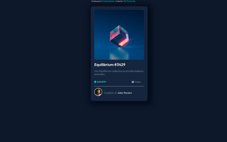
Design comparison
Solution retrospective
Hello, mentors! Please help me go through my work. Help a mentee grow. Thanks.
Community feedback
- @AdrianoEscarabotePosted over 2 years ago
Hello! you did a great job in this challenge. Your report has some problems:
1- the main content is stretched due to the height you set as
height: 90vh;we can make a simple change that will solve the problem :main { height: 620px; }You can use other units of measurement this was just an example.2- There are some other errors in the HTML that you can check through this link:click here
Hope it helps:)...don't forget to mark it as helpful 👍
Marked as helpful1@TobbyFrancPosted over 2 years ago@AdrianoEscarabote Thank you so so much! will work on it asap
1 - @elaineleungPosted over 2 years ago
Hi TobbyFranc, there seems to be some issues with responsiveness when I'm resizing the browser, and I see that you got a number of properties in your
.mainelement that's messing it up, especially thewidth:25%. If you view this on a mobile screen, the width would only be 1/4 of your screen, which is way too small. What I'd do is usemax-widthinstead, so try addingmax-width:25remto your main element, and try to useremunits instead of percentages. Also remove thetopandleftproperties, and also removeposition: absolute; you don't want to use absolute positioning as that means your card is fixed on the screen at one spot and won't move even if the browser is resized.Lastly, to center the card, add these to your body element:
display: grid;
place-content: center;
min-height: 100vh;
Hope this helps!
Marked as helpful0@TobbyFrancPosted over 2 years ago@elaineleung Sigh of relief! Thank you so much for taking time out. I really appreciate this. This knowledge is golden. This is so helpful. Thank you for being a mentor.
1@TobbyFrancPosted over 2 years ago@elaineleung Please I got 8 HTML issues report (reduced from 11). I have checked the raised issues but cannot seem to understand where the alarm is coming from. Could you help with interpretation, please? I would understand if you are busy too. Anyways, Thank you. You have been really helpful already in my journey. Oshey!
1@elaineleungPosted over 2 years ago@TobbyFranc I'll see if I can help with some of this:
For the issue "The document is not mappable to XML 1.0 due to two consecutive hyphens in a comment": There's an extra hyphen that shouldn't be there. Normally with commented out content in HTML, it should be
For the issue "CSS: transform: too few values for the property transform": I think this concerns the
transitionproperties in your CSS because I see that you've got them astransition: 0.5s. Thetransitionproperty is a short form, meaning that it is one property that combines several properties, such astransition-delay,transition-property, etc., and this short form needs at least thetransition-propertyvalue and thetransition-duration, but you only got the duration listed. You need to add the name of the property, or if you instead to have all them "watched", just ustransition: all 0.5s.With the
:hostpseudo class error, I'm not exactly sure what's going on but I think it might have something to do with your pseudo element using Font Awesome 6 Free, so try using something else instead. If this is for the eye svg icon, you shouldn't need to use a pseudo element. You can have a look at my solution if you need to: link hereGood luck!
Marked as helpful0
Please log in to post a comment
Log in with GitHubJoin our Discord community
Join thousands of Frontend Mentor community members taking the challenges, sharing resources, helping each other, and chatting about all things front-end!
Join our Discord
