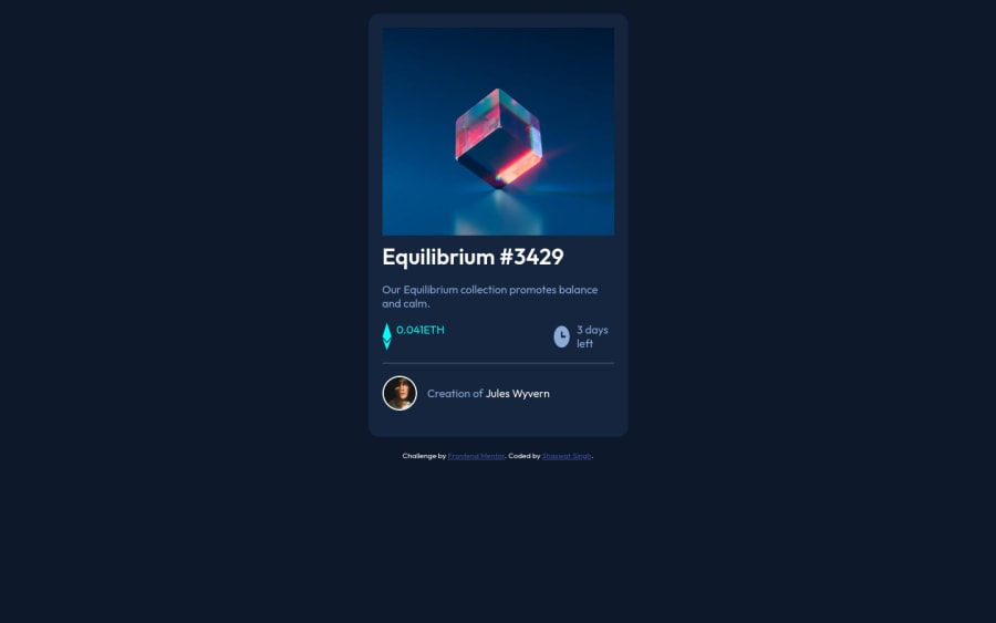
Design comparison
Community feedback
- @correlucasPosted over 2 years ago
👾Hello Shaswat Singh, congratulations for your new solution!
Your solution is amazing, you've only two issues about the responsivity to fix, note that the image and the container are not responsive due the
fixed widthyou can replacewidthwithmax-widthto fix this issues. See the fixes below:This to make the container responsive:
.card {
    max-width: 375px;
}
This to fix the icon distorting
img {
    display: block;
    max-width: 100%;
    height: auto;
}
👋 I hope this helps you and happy coding!
0 - @correlucasPosted over 2 years ago
👾Hello Shaswat Singh, congratulations for your new solution!
Your solution is amazing, you've only two issues about the responsivity to fix, note that the image and the container are not responsive due the
fixed widthyou can replacewidthwithmax-widthto fix this issues. See the fixes below:This to make the container responsive:
.card {
    max-width: 375px;
}
This to fix the icon distorting
img {
    display: block;
    max-width: 100%;
    height: auto;
}
👋 I hope this helps you and happy coding!
0
Please log in to post a comment
Log in with GitHubJoin our Discord community
Join thousands of Frontend Mentor community members taking the challenges, sharing resources, helping each other, and chatting about all things front-end!
Join our Discord
