


Web Wizard• 5,690
@rsrclab
Posted
Hi, Chris Caracach, Congratulations on your wonderful solution. I have studied your solution carefully and learned a lot from it. Here are some points I got on your solution.
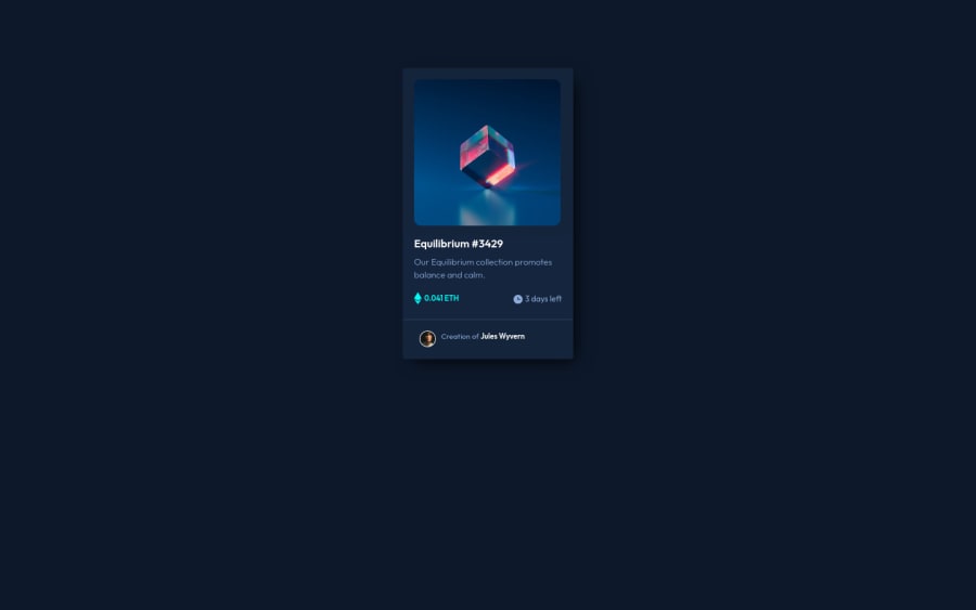
- Font sizes and spacings are a bit far from design, I think. In my opinion, as long as we have designs, front-end developers must get familiar with pixel-perfect solutions.
- Hover effect is excellent, but if you have transition effect on them, it would become greater.
- 3 days left string and clock icon doesn't go on one line. You can check on this part carefully.
https://www.frontendmentor.io/solutions/my-first-solution-on-chanllenge-V-4IzAivH Here is my solution, and if you can get something from it, it would be a great happy to me. Happy coding ~
Marked as helpful
0
