Design comparison
Solution retrospective
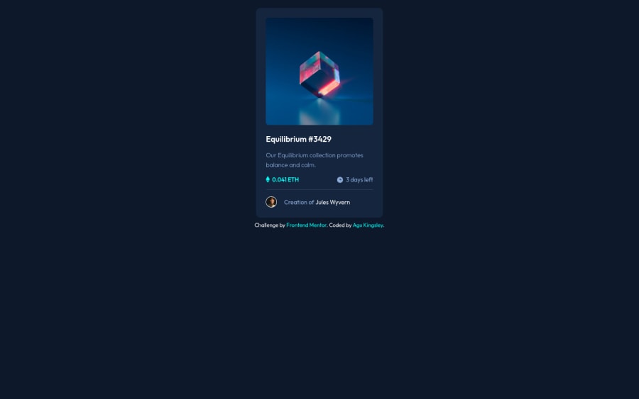
I found working with the equilibrium image challenging since I had to change the image color and also display an svg icon at the center of the image. I think this was the most challenging aspect of this FEM challenge. I had to go through pseudo classes and elements. Please go through my code and help me improve my frontend skills. Thanks for your guidance.
Community feedback
- @didyouseekyngPosted over 2 years ago
@grace-snow, @ApplePieGiraffe please I need your review based on the accessibility side of this challenge.
0@grace-snowPosted over 2 years ago@didyouseekyng I’m afraid the html needs rewriting on this
- Anywhere there is a hover style in the design that indicates interactivity. You have not used any interactive elements here so no interactive behaviour can happen. Once correct interactive elements are added, focus-visible styles need adding for keyboard users, and text or labels need to communicate to screenreader users what happens on click
- Heading elements must only be used for headings. They are extremely important semantically
- In cases where multiple headings are needed on a design (they’re not in this challenge), they must go in order and never skip levels. They are what communicates structure of the content on a webpage, like with any document
- If images are decorative, alt needs to be blank
Good luck with it
Marked as helpful1@didyouseekyngPosted over 2 years ago@grace-snow I really appreciate the time you have spent reviewing my code.
- Firstly, I thought the interactivity just deals with when you hover the image and it changes the background color with the svg icon on display. You made mention of no interactive elements , please can you help me with a resource so I can perform better in that aspect.
- Speaking on your third point, from my FEM report, it was an a11y issue and I'm currently working on the restructuring of the content.
- Why does the image have to be blank if it's decorative? I thought that would be an a11y issue?
- Lastly, sometime last year, you reviewed my code which helped me in terms of class naming which led me to learn the BEM style, and with that I also stepped into Sass. I really want to thank you for your input towards my progress. I have to be more conscious of my a11y from now on.
0@grace-snowPosted over 2 years ago@didyouseekyng accessibility means making content perceivable, operable, understandable and robust (POUR)
If you don't use interactive elements, this solution is not useable, for anyone but especially keyboard and screenreader users
0
Please log in to post a comment
Log in with GitHubJoin our Discord community
Join thousands of Frontend Mentor community members taking the challenges, sharing resources, helping each other, and chatting about all things front-end!
Join our Discord