Submitted about 3 years ago
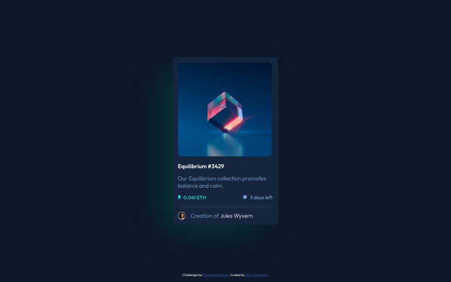
NFT card component using HTML and CSS only
#styled-components
@Yash-devasp
Design comparison
SolutionDesign
Solution retrospective
This is my second solution and Thanks to the peeps who pushed me forward in my journey to become a frontend developer. This is my second challenge. And Although I completed the solution I would love to know how I could have improved my code for the following challenge.
Note:- I know that the shadow was not included in the challenge but I included it because I was trying how to use shadows.
Community feedback
- @maestroeffectPosted about 3 years ago
that green border is nice and cool but it is not necessary
0
Please log in to post a comment
Log in with GitHubJoin our Discord community
Join thousands of Frontend Mentor community members taking the challenges, sharing resources, helping each other, and chatting about all things front-end!
Join our Discord
