

Design comparison

Solution retrospective
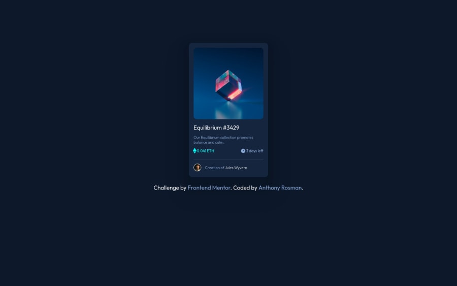
This is my first challenge, the most difficult part for me was the hover in the image, i think i could improve a little bit more, but im still learning, im so proud that i could did it, happy codding guys♥,
Please log in to post a comment
Log in with GitHubCommunity feedback
- @Renato6GS
Hi from Facebook!
Very good job Rosman, I like the effect you put on the image.
I get a small responsive error on screens larger than 20 inches, the card is not centered. And on screens larger than 1024px in height, the card looks too small.
I can suggest you use "media querys" to adjust the card size and font size according to the user's screen.
- @SelfReflective
Great Work Anthony Rosman!
I especially like the hovering on the main Image its REALLY smooth. Gotta learn how to do that ;)
One thing that i would like to mention ( its very suddle) is the ETH Symbol, its slightly larger than the text nexto it. If you look closely on the Sample the Icon is exactly in the middle of the text nexto it.
I did it by putting both elements in a div and then adding flexbox. after that align the items in the center - that should do it. But im sure there are many different way to do it :D
Cya Yu
- @MikevPeeren
Hey 👋
Good job finishing this one 👏
My only comment would be to add more descriptive text for the nft as a screenreader would like to know what they are buying.
- P@jairovg
Hi @D3press3dd, here are some comments:
- You're adding a fixed width to the
cardelement. Instead of doing that, I would suggest you use amax-widthon this element, adding some left and right margins on mobile versions and anautomargin on greater devices. - Use more semantic elements, like the
card-titleelement, this should be anh1. See more here. - I've seen you're using the base font size as
62.5%. I don't know if you did it intentional in order to get a base size of10pxso thefont-sizegets equivalent values like1.2remas12px. You may have unexpected behaviors if a browser does not have a defaultfont-sizeas16px. I suggest you use the basefont-sizeas the one in thestyle-guideand then calculate theremsfor the rest. - As @Renato6GS mentioned, there is an issue with large devices, is not a browser related issue. The problem is that you placed a fixed size on the body as
144remso the card is getting centered inside this fixed width. - Consider taking a look on your a11y report.
PD: Nice transitions on page elements, btw.
- You're adding a fixed width to the
- @D3press3dd
The tricky part in the hover is the duration of the transitions, thats all,without realizing i damaged the design😥😥, thanks for the observation💞💞 I will accommodate it, I still applied flexbox but maybe changing some things I forgot to fixed again.


Join our Discord community
Join thousands of Frontend Mentor community members taking the challenges, sharing resources, helping each other, and chatting about all things front-end!
Join our Discord