Design comparison
Solution retrospective
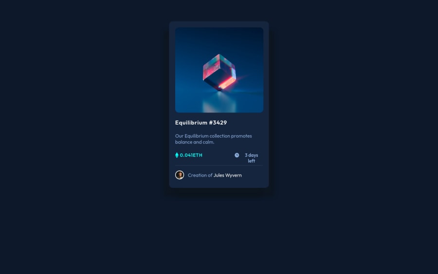
This is a preview of the NFT card component made with HTML and CSS. Happy to get some feedback on this and happy to get some suggestions in my code too. Thank you!!
Community feedback
- @denieldenPosted almost 3 years ago
Hi Ayush, great job!
- try to use flexbox to the body for center the card. Read here -> flex guide
- remove all
marginfromboxbecause with flex they are superfluous. - after set
heigthof body to100vhbecause Flexbox aligns to the size of the parent container. - add
maintag and wrap the card for Accessibility - Also instead of using
pxtry to use relative units of measurement -> read here
Overall you did well! Hope this help ;)
Marked as helpful0@Ayush1MPosted almost 3 years ago@denielden Thank you so much for your valuable suggestion. Well I have not thought of using flexbox but after looking back at my code you are right it will be much easy. And now I get that I have to set the height of body to vh to properly size it. These suggestions will really help me to improve.
1@denieldenPosted almost 3 years ago@Ayush1M I am happy that they are helpful to you :) Keep it up !
1 - Account deleted
Hello there! 👋
Congratulations on finishing your challenge! 🎉
I have some feedback on this solution:
-
Always Use Semantic HTML instead of
divlike<main><header>, etc for more info -
Give The body these properties to center the element
display:flex justifiy-content:center align items: center min-height:100vh
if my solution has helped you do not forget to mark this as helpful!
Marked as helpful0@Ayush1MPosted almost 3 years ago@Old1337 Thank you for your valuable suggestion. I will keep this in mind next time.
1 -
Please log in to post a comment
Log in with GitHubJoin our Discord community
Join thousands of Frontend Mentor community members taking the challenges, sharing resources, helping each other, and chatting about all things front-end!
Join our Discord
