Submitted about 1 year agoA solution to the NFT preview card component challenge
NFT Card Component
tailwind-css, accessibility

@KapteynUniverse
Solution retrospective
What are you most proud of, and what would you do differently next time?
I did this challenge to try tailwind. Also used tailwind and deployed to netlify for the first time.
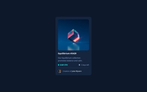
What challenges did you encounter, and how did you overcome them?Keeping the opacity of the view icon while giving the NFT img a pale background was difficult at first then i found group styling of tailwind.
What specific areas of your project would you like help with?Any feedback is appreciated but i would like to get feedback about accesibility and semantics. Also i can see font family is correct on computed tab of the dev tools and can toggle on styles but for some reason on console there is a 404 error for the font.
Code
Loading...
Please log in to post a comment
Log in with GitHubCommunity feedback
No feedback yet. Be the first to give feedback on Asilcan Toper's solution.
Join our Discord community
Join thousands of Frontend Mentor community members taking the challenges, sharing resources, helping each other, and chatting about all things front-end!
Join our Discord