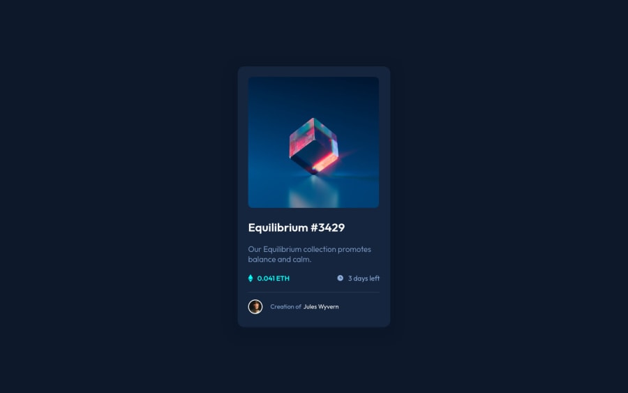
Design comparison
SolutionDesign
Community feedback
- @AdrianoEscarabotePosted about 2 years ago
Hi, how are you?
You did a great job on this challenge. I have two tips that I think you will like:
1- Page should contain a level-one heading. click here
2- I noticed that you didn't put the image with the
hovereffect, there are many ways to do this effect, I invite you to look at my last challenge, there I did it in a very easy way.The rest is really good!
Hope it helps... 👍
Marked as helpful0 - @shivaprakash-sudoPosted about 2 years ago
Hello Chakiri,
Your solution looks perfect!
Just a few things I'd like to suggest, if you don't mind.
- I think you forgot to add the hover eye effect to the main image, so please look into that.
- Try to use a separate file for styling, because it's better to maintain when the code gets bigger.
- Try to wrap the content using
main, instead of justdiv. - Usually sections are used for content which span across the full width of the screen, so here you can use
divs inside the card and you can usesectionorarticlefor wrapping the whole card. - Try to update your readme file from the README-template file given along with project files, it helps you think about what you learnt and what you can improve on further.
Keep up the good work, I hope to see more of your work.😁
Marked as helpful0
Please log in to post a comment
Log in with GitHubJoin our Discord community
Join thousands of Frontend Mentor community members taking the challenges, sharing resources, helping each other, and chatting about all things front-end!
Join our Discord
