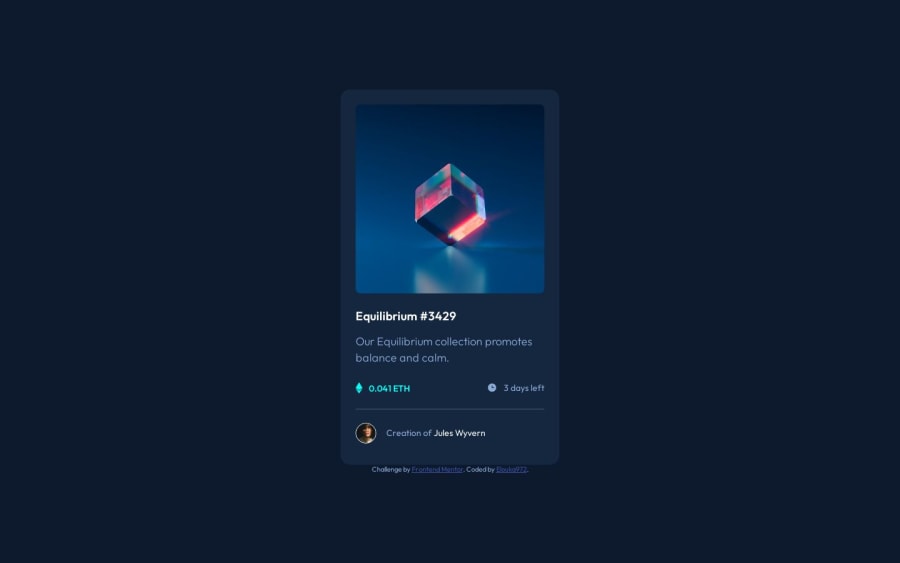
Design comparison
SolutionDesign
Solution retrospective
- Can you give me a feedback on my challenge in order to improve myself?
- Do you have any advice to give me?
Community feedback
- @0xabdulkhaliqPosted over 1 year ago
Hello there 👋. Congratulations on successfully completing the challenge! 🎉
- I have other recommendations regarding your code that I believe will be of great interest to you.
CSS 🎨:
- The
transitionis not applied perfectly, if you apply a CSStransitiononly onhover, thetransitionwill only occur when the userhoversover the element, but when the user stopshovering, thetransitionwill not be reversed, resulting in an abrupt change. This can be jarring and not desirable from a UX perspective.
- To avoid this issue, you can add the transition rule
transition: .8s ease-out;for the default state of the element.card-img .afteralong withopacityproperty to maintain thetransition. This will ensure that when the user stops hovering, the transition will smoothly revert back to the original state. You can do this by setting the default state transition to the same property values but with a longer duration or a different easing function.
- The modified css is here,
.card-img:hover .after {
  opacity: 1;
}
.card-img .after {
  position: absolute;
  top: 0;
  left: 0;
  width: 100%;
  height: 100%;
  border-radius: 8px;
  transition: .8s ease;
  opacity: 0;
  display: flex;
  justify-content: center;
  align-items: center;
  background: rgba(0, 255, 248, .5);
}
- Now the issue has been rectified, component got cool
transitionalso
.
I hope you find this helpful 😄 Above all, the solution you submitted is great !
Happy coding!
Marked as helpful0
Please log in to post a comment
Log in with GitHubJoin our Discord community
Join thousands of Frontend Mentor community members taking the challenges, sharing resources, helping each other, and chatting about all things front-end!
Join our Discord
