Design comparison
Community feedback
- @PhoenixDev22Posted almost 3 years ago
Hello @MintMissy ,
I have some suggestion:
-
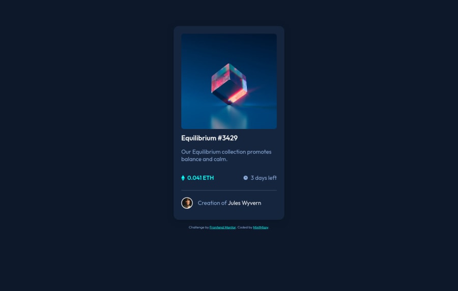
Anything with a hover style in the design means it's interactive . You need to add an interactive element around the image and
Equilibrium #3429,Jules Wyvern.(in this challenge is an anchor tag<a>. -
For any decorative images, each
imgtag should have emptyalt=""andaria-hidden="true"attributes to make all web assistive technologies such as screen reader ignore those images. And alt text in the avatarimgshouldn't be empty and more descriptive not User avatar. read more about alt for informative or decorative images. -
You can use unordered list
<ul>to wrap<div class="card__details">and in each list item would have<img >and<p>. -
The eye image doesn't really need to be in the html, you could do it with css.
-
You shouldn't have used
<hr>. You can useborder-topfor the<div class="card__credits">
Hopefully this feedback helps.
Marked as helpful1@MintMissyPosted almost 3 years agoThank you so much for feedback bro <3. I'm gonna analyze your suggestions and improve my work today :3. Have a nice day @PhoenixDev22. One more time I must thank you for your feedback!
0@MintMissyPosted almost 3 years ago@PhoenixDev22 I've made improvements to my work. Today I learned a lot of stuff about informative and decorative images that I haven't known before. I'm glad that you reviewed my work and I could make these little things to make make it compatible with screen readers.
I'm still wondering why I shouldn't have used <hr/> tag. Could you explain it to me? Why should I have used border-top instead <hr/> tag?
0 -
Please log in to post a comment
Log in with GitHubJoin our Discord community
Join thousands of Frontend Mentor community members taking the challenges, sharing resources, helping each other, and chatting about all things front-end!
Join our Discord
