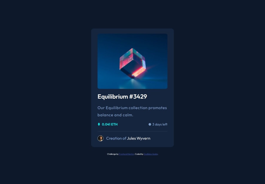
Design comparison
Solution retrospective
learnt how to implement BEM in my markup and learning how to configure and use less in my development process
What challenges did you encounter, and how did you overcome them?making my font-size responsive using the clamp() function
What specific areas of your project would you like help with?I'd like reviews for my less and css structuring and making use of the clamp(), min(),max(), and calc() function to adjust my width, font-size and other responsivity
Community feedback
- P@danielmrz-devPosted about 1 year ago
Hello @TariCodes!
Your project looks great!
It's quite a challenge to add that hover effect with the overlay image properly. Here's how you can do it:
HTML
<img src="images/image-equilibrium.jpg" alt="Equilibrium" class="pic">
  <div class="icon">
    <img src="images/icon-view.svg" alt="icon-view" class="icon-view">
  </div>
CSS
.pic {
   width: 300px;
   background: url('images/icon-view.svg') center center no-repeat;
   background-color: $Cyan-hover;
   background-size: cover;
   margin: auto;
   border-radius: 10px;
}
.icon {
   display: grid;
   justify-content: center;
   align-items: center;
   position: absolute;
   opacity: 0;
   background-color: $Cyan-hover;
   width: 300px;
   height: 300px;
   border-radius: 10px;
}
icon:hover {
   opacity: .5;
   cursor: pointer;
}
Just don't forget to change the class names to match yours.
I hope it helps!
Other than that, you did an excelent job!
Marked as helpful1
Please log in to post a comment
Log in with GitHubJoin our Discord community
Join thousands of Frontend Mentor community members taking the challenges, sharing resources, helping each other, and chatting about all things front-end!
Join our Discord
