


Design comparison


Solution retrospective
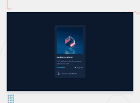
- Hands down the biggest challenge I faced with this one was the hover effect on the main image of the card. I ended up coming up with my own solution for this which was to add a span with
position: absoluteandopacity: 0right on top of the image, and then transition the opacity on hover so it becomes visible.
Even though the end product works, I am not completely satisfied with it as it goes completely off-axis when the browser is zoomed in. Definitely a topic to learn more about before the next challenge and I would love to know how you would implement a similar hover for an image!
- This challenge also thought me about the importance of planning out the project and good-structured markup. Although it visually looks similar to the proposed design, I felt that I had to constantly come up with workarounds to cover up the gaps in how I structured my markup.
In a real project do you structure out your HTML before writing any CSS or do you take one thing at a time and add up to the markup as they come?
Community feedback
Please log in to post a comment
Log in with GitHub
Join our Discord community
Join thousands of Frontend Mentor community members taking the challenges, sharing resources, helping each other, and chatting about all things front-end!
Join our Discord