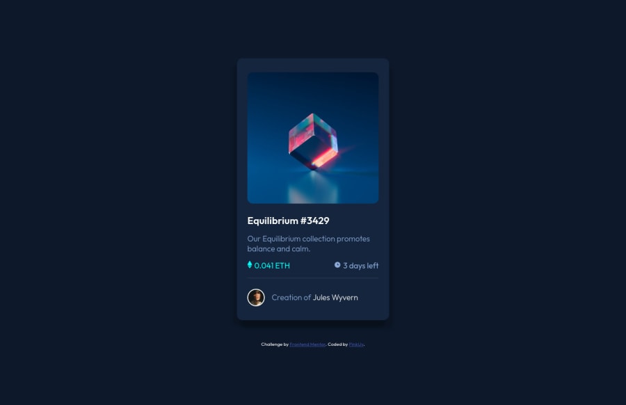
Design comparison
Solution retrospective
I ran into two issues I need some help fixing if possible.
First, the active hover for the main image is incredibly buggy, I had to end up eyeballing the measurements because they seem to be constantly scaling based on viewport size. However, this results in a warped hover whenever your display doesn't match my native monitor size; I could use some help finding out why it keeps resizing and how to fix it.
Secondly, when it comes to the icons for the price and time they aren't centered along with the text. I positioned both using ::before relative to their classes but I can't seem to get them to move after that. Is there a way to fix their position? or do I have to scrap using ::before and try something else?
Other general code critique and criticism is welcome, thanks in advance!
Community feedback
- @Ibarra11Posted over 2 years ago
The main issue with the hover overlay is that it is not constrained to the box that contains the image. In this case, you want want to set the article with class of main-image to relative now the overlay which has the property of absolute will be positioned relative to the article element. With that being set you can set the width of the overlay to 100%, which will be the width of the article element and give it a height of 100% and will give it the height of the article element. I also moved the margin from the image to the article element and removed padding as well. Linked is a code sandbox if you want to take a look: Code Sandbox
Marked as helpful2@PinkUvPosted over 2 years ago@Ibarra11
Ah I understand, thanks for the help and the sandbox: made it very easy to walk through your steps. Appreciate it!
0 - @elaineleungPosted over 2 years ago
Hi PinkUv, first off, great job in completing your second challenge here, and I think you've done very well! I'll try to answer your questions 🙂
About the hover overlay
The main issue is that, there's a
position: absolute
on the overlay container, but there isn't aposition: relative
set on the container you want it to be in position with. Whenever we useposition: absolute
, we are taking the container out of its natural order in its node and giving it another position, and in order to position it, the browser needs to find the new point of reference. The browser will try looking up the tree to see which element has aposition: relative
, starting with the container's parent, and if there isn't one set there, it will continue up until it reaches the body element.Try this out: In the overlay div where you had set a
width: 11.9%;
andheight: 23.5%;
, try changing those values to 100% and changetop
to 0, then see how big the overlay gets. After that, set aposition: relative
on themainImage
container, and you should see the overlay placed almost on top of the image. Remove all the margins and paddings you added in the image and inmainImage
, and you should see the overlay placed perfectly on top.About the icons
Instead of pseudo elements and instead of lists, I would have the icons and the text as inline-block containers, like this:
<div class="nft-info"> <div class="price"> <img /> <span>0.041 ETH</span> </div> <div class="time"> <img /> <span>3 days left</span> </div> </div> // You can put empty alt="" tags and aria-hidden="true" in the icons' img tags to hide them from the screen reader
The CSS would look something like this:
// turn the divs into flexbox .nft-info { display: flex; justify-content: space-between; align-items: center; margin-bottom: 1rem; } .price, .time { display: flex; align-items: center; } // turn all the children into inline-block .price *, .time * { display: inline-block; } // put some space between the children using margin // by selecting the first direct child using > * .price > *, .time > * { margin-right: 0.5rem; }
I also completed this challenge, and you can check out my solution as well: https://www.frontendmentor.io/solutions/reponsive-nft-preview-component-W2gWx-dAyA
Good luck, and happy coding!
Marked as helpful2@PinkUvPosted over 2 years ago@elaineleung
Hi, fixing the position settings did the trick and thanks for the alternative option for the pseudo elements. Thanks for the explanation for relative and absolute!
1
Please log in to post a comment
Log in with GitHubJoin our Discord community
Join thousands of Frontend Mentor community members taking the challenges, sharing resources, helping each other, and chatting about all things front-end!
Join our Discord