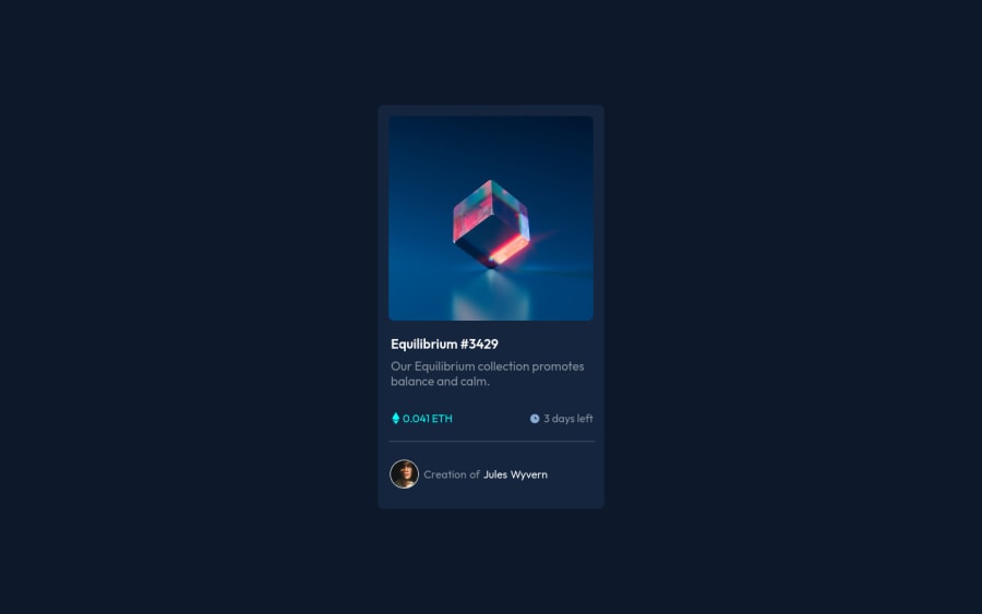
Design comparison
Solution retrospective
I have not well optimized it for mobile can anyone suggest me how it can be done other than media query like can i learn bootstrap framework
Community feedback
- @EmmanuelHexerPosted over 2 years ago
Hi @Akash-pugazh, I took some time to look at your solution and you did a great job!
However I have some tips for improving your code:
-
Avoid using in-line styles in your html. Use css to style your page on a seperate document. What i mean is you should'nt use ie
color: #fb2342in your html but rather do it in css file. -
wrap your card in a <main> element to fix accessibility issues.
Hope this help and happy coding!
Marked as helpful0 -
- @NaveenGumastePosted over 2 years ago
Hello Aakash ! Congo 👏 on completing this challenge
Let's look at some of your issues, shall we:
- Warp your card content around the main tag Ex: 👇
<body> <main class="container"> *all you content here* </main> </body>-
Always use
h1first and thenh2,h3and so on -
use the font-weight as given in style-guide
happy Coding😀
0
Please log in to post a comment
Log in with GitHubJoin our Discord community
Join thousands of Frontend Mentor community members taking the challenges, sharing resources, helping each other, and chatting about all things front-end!
Join our Discord
