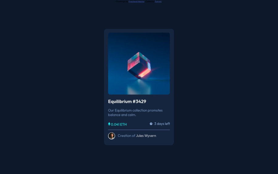
Design comparison
Solution retrospective
I struggled a bit on this project. Spent a lot of hours on it. Any feedback would be greatly appreciated. The hover effect was a challenge for sure. I am still unfamiliar with flexbox so I used transform for the positioning. My code is a bit of a mess because I was trying different things. For some reason, the live site works well on my mobile and brave browser but doesn't work well on chrome. Or maybe it's my chrome. Any feedback would be welcomed. Thank you very much
Community feedback
- @Li-BeePosted about 3 years ago
Really good just two things which are tiny amends and the card looks good anyway.
- The ETH and time stats font-weight needs to be increased
- the border line needs to be a bit thinner.
0 - @AmmarCodePosted about 3 years ago
Almost perfect application of the design, good job!
0
Please log in to post a comment
Log in with GitHubJoin our Discord community
Join thousands of Frontend Mentor community members taking the challenges, sharing resources, helping each other, and chatting about all things front-end!
Join our Discord
