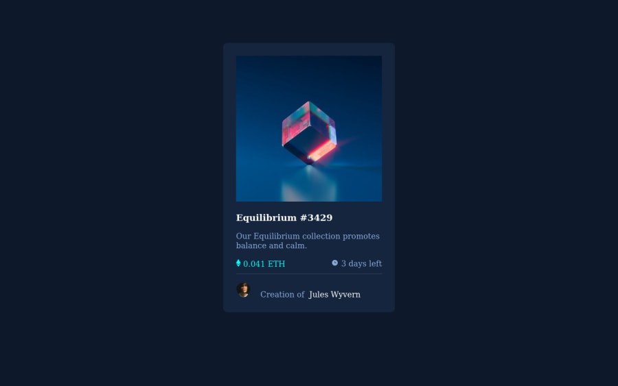
Design comparison
Community feedback
- @VCaramesPosted about 2 years ago
Hey there! 👋 Here are some suggestions to help improve your code:
-
To better specify the main content of you site you will want to encase your entire component inside a Main Element.
-
To center you content to your page, add the following to your Body Element:
body { min-height: 100vh; display: grid; place-content: center; }-
Reduce 📉 the
widthof the component to better match the FEM example. -
Change
widthtomax-widthin your component’s container to make it responsive. -
The NFT Alt Tag description needs to be improved upon. You want to describe what the image is; they need to be readable. Assume you’re describing the image/icon to someone.
-
Along with the blank alt tag, you also want to include the aria-hidden=“true” to your icons to fully remove it from assistive technology.
-
Wrap the "NFT image", "Equilibrium #3429" and "Jules Wyvern" in an Anchor Tags <a>. The anchor tag will allow users to click on content and have them directed to another part of your site.
If you have any questions or need further clarification, let me know.
Happy Coding! 👻🎃
0 -
Please log in to post a comment
Log in with GitHubJoin our Discord community
Join thousands of Frontend Mentor community members taking the challenges, sharing resources, helping each other, and chatting about all things front-end!
Join our Discord
