Design comparison
Solution retrospective
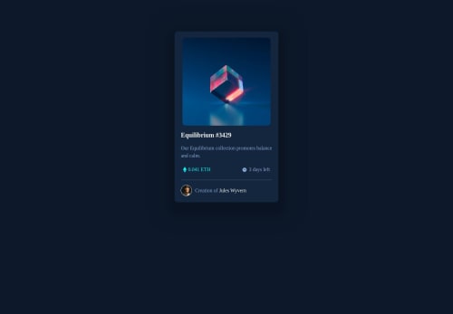
I am not sure about the image hover effect. I couldn't make it fit the image and let it be a bit bigger at the bottom. I appreciate any feedback about my code like the way I write code or the way others understand the code.
Community feedback
- @florianstancioiuPosted over 1 year ago
Hi Laura,
Here is my advice on the eye section of the challenge:
You can overwrite the existing
.overlay
div with this HTML structure:<div class="overlay-wrapper"> <div class="overlay"></div> <img class="icon" src="" alt="Eye Icon" /> </div>
Don't keep the eye icon inside the
.overlay
div because the opacity property affects every single child element. Use the z-index property to get the.icon
in front of the.overlay
.Note: The z-index property only works if there's a position property on the element as well.
Here is some advice that will help you write better CSS code overall:
-
Install prettier in Visual Studio Code (I asume you use vscode). Follow a youtube tutorial if you can't get the hang of it with the written text, prettier is a must have for a beginner.
-
Use
rem
instead ofpx
, here is a video about it. And here is how to use rem in a nutshell: you set the font-size of the html tag to 62.5% which makes1rem
equal to10px
for all child elements
html { font-size: 62.5%; } body { font-size: 1.4rem; } /* =14px */ h1 { font-size: 2.4rem; } /* =24px */
- Instead of doing this in CSS:
* { margin: 0; padding: 0; box-sizing: border-box; }
Use a modern CSS reset like this one here.
Marked as helpful0 -
Please log in to post a comment
Log in with GitHubJoin our Discord community
Join thousands of Frontend Mentor community members taking the challenges, sharing resources, helping each other, and chatting about all things front-end!
Join our Discord