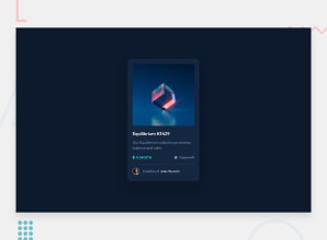
Design comparison
Community feedback
- @obocanegra-devPosted over 1 year ago
Hello Victor! 👋
Congratulations on your amazing design! It looks fantastic, and I want to highlight the great work you've done.
Here are some suggestions to further enhance your project:
I highly recommend using semantic elements instead of relying on numerous
<div>s. Semantic elements like<header>,<nav>,<main>, and<footer>add meaning and structure to your HTML, improving accessibility and SEO.I don't think the
margin: 16px;on.cardis necessary. In fact, it may prevent proper centering on mobile screens. I suggest reviewing and adjusting the margin to ensure that the content appears centered on all screens.Instead of specifying a fixed width (
width), I recommend usingmax-width. This will make the elements more responsive and adapt better to different screen sizes.For interactive elements, it's preferable to use either
<a>or<button>tags, depending on the appropriate use case. This will help users clearly identify interactive areas and improve the usability of your project.Furthermore, everything else looks great. I encourage you to play around with transitions and hover effects in this design. It can add an extra touch of interactivity and enhance the user experience.
Keep up the excellent work and continue exploring your creativity! I'm confident that you'll achieve even more impressive results in your future projects. Go for it! 💪🚀
If you have any questions or need further assistance, feel free to ask. Enjoy your development journey!
Best regards, Oscar
0
Please log in to post a comment
Log in with GitHubJoin our Discord community
Join thousands of Frontend Mentor community members taking the challenges, sharing resources, helping each other, and chatting about all things front-end!
Join our Discord
