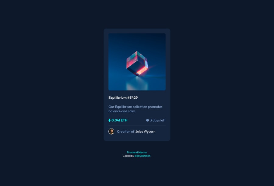
Design comparison
Solution retrospective
First, as Frontend Mentor suggested themselves, I tried structuring out markup first. Keeping in mind accessibility, and user keyboard interaction. Then came styling stage, a bit fixing markup and laying out almost everything as a flexbox item. It was a bit hard though, because a while ago I saw a someone laying out an entire page using flexbox, so I wanted to do the same. Obviously, I was really hard, eventually I just used some wrappers... :/
After that and some tweaking, I considered how exactly some users would try to interact with it, keeping in mind that it is a part of a bigger webpage. I remembered that Frontend Mentor actually turns off links on images that can be accessed with titles otherwise. So I did the same, you can still go to the card's page through both image and a title when you click, but when you use keyboard, on every card there is only two links, the others are just skipped(used tabindexes).
Added simple fading in-out transition on hover. That was not enough...
So, I figured there were two ways to tackle this challenge, first - using pseudo elements, second - changing(probably messing up) markup. I went for the first one.
If the eye svg were in the markup I would've easily change its properties using css, but in pseudo elements I didn't find a way to access it using css. So manipulating svg paths was not an option. The other idea that I've been thinking to try out was using clip-path. I tried it out, it was a good animation, but that wasn't enough either I wanted it to "blink". I remembered that you can transform elements, and you can transform them along both axis. I applied scaleY(), and it looked like just sliding out; added scaleX() too, now it looks something good enough.
The possible and probably better solution for animations would still be using some additional elements to transform in the markup... But that's for another time.
Check out my live repository live page(all my front projects will be there)
Please, Your suggestions are very welcome and appreciated!
Community feedback
Please log in to post a comment
Log in with GitHubJoin our Discord community
Join thousands of Frontend Mentor community members taking the challenges, sharing resources, helping each other, and chatting about all things front-end!
Join our Discord
