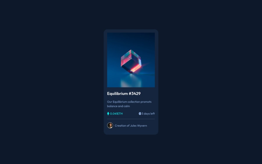
Design comparison
SolutionDesign
Community feedback
- @denieldenPosted over 2 years ago
Hi Matheus, I took some time to look at your solution and you did a great job!
Also I have some tips for improving your code:
- add descriptive text in the
altattribute of the image - To make it look as close to the design as possible decrease the dimension of eye image
- add
border-radius: 1rem; and overflow: hidden;to.bannerclass
Overall you did well :)
Hope this help and happy coding!
0 - add descriptive text in the
Please log in to post a comment
Log in with GitHubJoin our Discord community
Join thousands of Frontend Mentor community members taking the challenges, sharing resources, helping each other, and chatting about all things front-end!
Join our Discord
