Design comparison
Solution retrospective
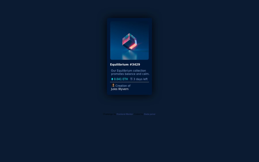
please how did y'all make the image show after being hovered on?
Community feedback
- @Cr0zy07Posted about 2 years ago
Hi There, I used the 'after' pseudo element on the outer 'div' of the image, and added relative position on that 'div'...
Take a look at this snippet...
.card .card-image { height: calc(320px - 3rem); width: calc(320px - 3rem); border-radius: 1rem; position: relative; overflow: hidden; }
.card .card-image::after { content: ""; height: 100%; width: 100%; position: absolute; top: 0; left: 0; background: hsl(178, 100%, 50%, .5) url('images/icon-view.svg') no-repeat center; opacity: 0; transition: .5s ease; }
, or better see my solution to get better understanding https://cr0zy07.github.io/training/NFT-preview-card-component/...
Good luck...
Marked as helpful0
Please log in to post a comment
Log in with GitHubJoin our Discord community
Join thousands of Frontend Mentor community members taking the challenges, sharing resources, helping each other, and chatting about all things front-end!
Join our Discord
