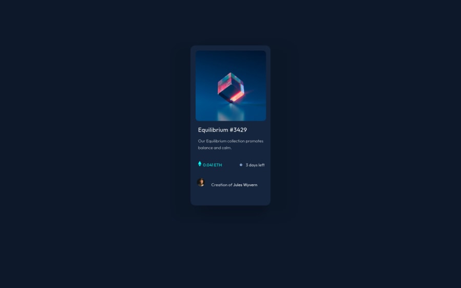
Design comparison
Community feedback
- @kodaicoderPosted over 2 years ago
Hi fggdfg , congratulations on completing the challenge 🎉
So at first I want to recommend you to try to rewriting on
Cardclass first it using so manymargin, instead of you usingmarginyou can try learning ondisplay:flexordisplay:gridit will help you centering a content (or a card in this project) you can learn it here flex and gridand about hovering on image it will should to having a overlay effect on the image you can learning how to create overlay effect here
last but not least you can change cursor to pointer on hover at text or element by using
ELEMENT:hover{ cursor: pointer; }you can change so many cursor style, you can learn about it here
and may be you can check out my solution too here
Keep Practice , Keep Learning
Marked as helpful0
Please log in to post a comment
Log in with GitHubJoin our Discord community
Join thousands of Frontend Mentor community members taking the challenges, sharing resources, helping each other, and chatting about all things front-end!
Join our Discord
