Submitted about 3 years ago
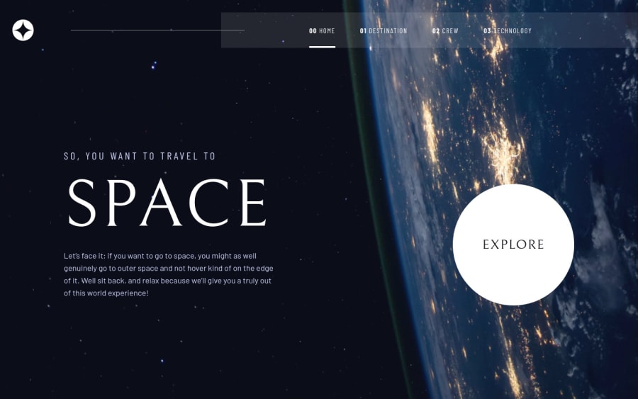
Nextjs Website with Tailwind css
#next#tailwind-css
@Yellow-May
Design comparison
SolutionDesign
Community feedback
- @rsrclabPosted about 3 years ago
Hi, @Yellow-May ~
Congratulate on your solution to the challenge on FM platform. I have studied your work carefully and learned a lot from it.
Here are some of the tips I like to provide.
- Please try BEM for naming element classes. It will help you a lot on bigger projects.
- I think explore button hover effect doesn't match design.
- Please try dark
background-colorfor pages, so that when moving between pages, it won't blink.
https://www.frontendmentor.io/challenges/space-tourism-multipage-website-gRWj1URZ3/hub/space-tourism-multipage-solution-LCqAfReWO
Here is my solution to this challenge, and if it can help you even a bit, it would be happy to me.
Cheers ~
Marked as helpful1
Please log in to post a comment
Log in with GitHubJoin our Discord community
Join thousands of Frontend Mentor community members taking the challenges, sharing resources, helping each other, and chatting about all things front-end!
Join our Discord
