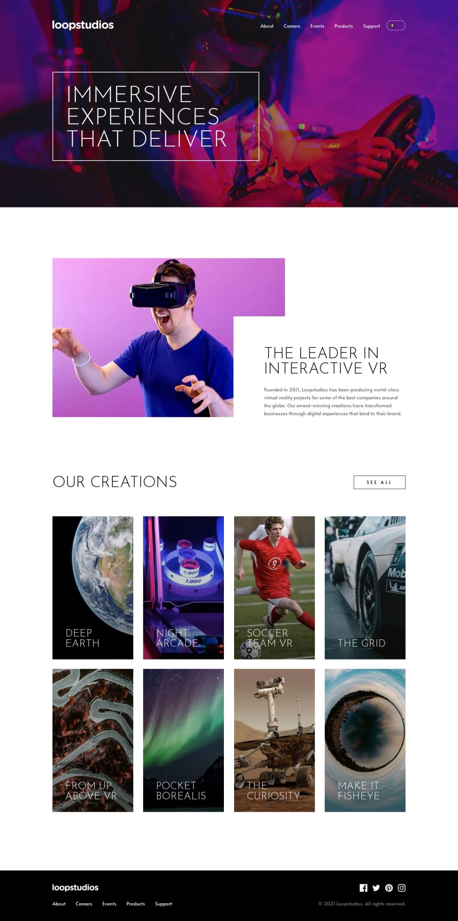
Design comparison
Solution retrospective
🦈 Greetings,
🏆 This is my solution for Loopstudios landing page
➕ Added
- theme-switch toggle
- prefers-color-scheme recognizer
- Navigation change style when scrolled
✅ pixel perfect (apart from theme switch toggle)
🚀 PageSpeed Insights Score :
- Desktop 100 / 100 / 95 / 100
- Mobile 99 / 100 / 95 / 100
🤖 Tech used:
- Typescript
- NextJS 13
- Tailwind CSS
Any feedback or comments are more than welcome.
Thank you, and let's all keep improving, learning, and becoming better! 💪
Community feedback
- @AkherousinPosted about 1 year ago
Hi, great work on completing the challenge. You did an awesome job.
Here are some things you might want to consider:
- The text on the cards is a bit hard to read. Maybe you could add some gradient to the them, like in design files?
I saw you using the aria-label, so you care for accessibility, which is amazing. However, some other aspects of the page could be more accessible for different users:
-
It’s a common practice to make the logo a link to the home page.
-
If you use a <ul> element inside your nav, it would help users who rely on assistive technologies (AT) to access the list of links on the page more easily.
-
In mobile menu you're using the generic div instead of the button element. So it is invisible to the AT users and to the keyboard users. Although you can enhance it into a button using various aria-attributes, it's best to use the native button element and aria-expanded to communicate if the mobile navigation is open. I think this resource might help you build accessible navigations in general. Check this out. Accessible Mobile Navigation
-
You use aria-label for your navigation links, but this might not be necessary, since it overrides the accessible names of the links that are already provided by their text content. Also, the accessible names should match the visible labels of the links, otherwise it could confuse users who use speech recognition software. For example, the ‘About’ link should have “About” as its accessible name, not ‘About page’.
-
Your toggle switcher is not operable by keyboard. A good alternative is to use native HTML elements, like radio buttons or checkboxes, or use a button with ‘aria-pressed’. You absolutely can make it look the same. These are some excellent resources that explain how to do this: Toggle Button A Theme Switcher
-
Using aria-label is not always the best option, because it’s not always translatable. More about it: ARIA-Label Does Not Translate
-
If you want to provide an accessible name to an icon link or an icon button, it’s usually better to use ‘aria-labelledby’ or a ‘visually-hidden’ class. This article shows how to do this: My Priority of Methods for Labeling a Control
Marked as helpful1@tserticPosted about 1 year ago@Akherousin Thanks for feedback and for time to write all this. Not only useful links but also explanation. Really appreciate it ❤
1
Please log in to post a comment
Log in with GitHubJoin our Discord community
Join thousands of Frontend Mentor community members taking the challenges, sharing resources, helping each other, and chatting about all things front-end!
Join our Discord