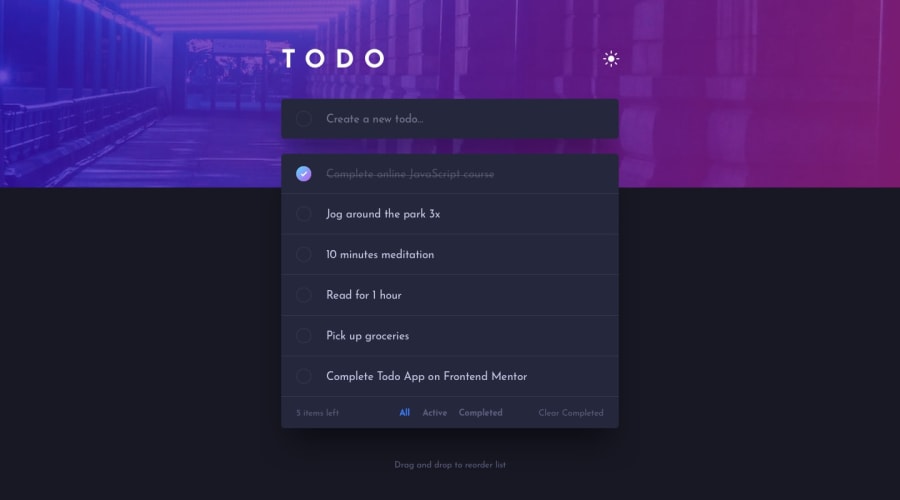
Design comparison
Solution retrospective
This was my first project using Tailwind CSS and I can see why so many people love it!
Played around with Framer Motion to make things feel more dynamic.
Any feedback would be much appreciated :)
Community feedback
- @abhik-bPosted over 4 years ago
Hi Chloe , This app looks amazing and I really liked :
- how smooth the drag n drop is,
- cross svg hover transition is cool
- when we check the input and then press enter , it actually inserts a checked todo, this is actually great and I did not see any other solution doing the same 🚀
Overall You have done a great job on this challenge , Keep it up 💯
1@clowormPosted over 4 years ago@abhik-b Thank you! These exercises have been great at strengthening my attention to detail. Every time I look at the design prompts I notice something new about the intended functionality
1 - @InKABuserPosted about 4 years ago
WOW, this is amazing. how did you do the animations? did you use gsap?
0
Please log in to post a comment
Log in with GitHubJoin our Discord community
Join thousands of Frontend Mentor community members taking the challenges, sharing resources, helping each other, and chatting about all things front-end!
Join our Discord
