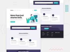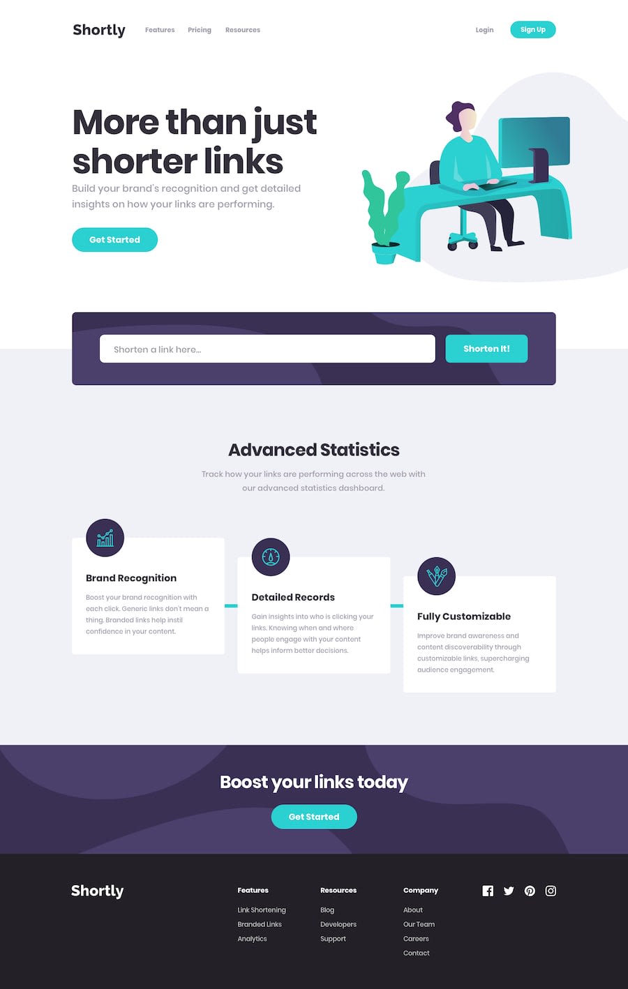
Design comparison
Solution retrospective
any feedback welcome
Community feedback
- @FexxixPosted over 1 year ago
Everything seems detailed there's really nothing wrong except two parts:
- When customizing a scroll bar, always keep in mind that you should never use units for it's width (and height if your setting it) that scale up or down when zoomed in or out, your scroll bar does scale based on zoom and it shouldn't since it makes the UI look ugly so I think you should fix it. Personally, I use viewport units for this.
Pro tip: You should use hover states for the scroll bar as well to make it visible only when needed. I'm suggesting it because the default ones do that.
- This one is just me being nitpicky. I like the subtle animation for when the sign in modal appears but what I don't like is that it just erases itself out of existence when you close it, same goes for the hamburger nav menu. Again, this is pretty opinionated so you don't have to fix it if you don't want to.
I could only list the things I thought you should fix since I wouldn't be able to list all the good parts of your solution. In fact, the things I did mention aren't all that important either. I guess what I am saying is that it just simply looks really cool and amazing and there isn't much wrong with it.
Marked as helpful1@diversisPosted over 1 year ago@Fexxix Thanks for your advice. Didn't even notice that about zoom. Fixed it to keep basic width with
::-webkit-scrollbar { min-width: 100%; }Could't fix animation exit issue yet. It's 'Framer motion' one and it came with precedent NextJS template by Steven Tey: https://github.com/steven-tey/precedent
Looking into it later.
0
Please log in to post a comment
Log in with GitHubJoin our Discord community
Join thousands of Frontend Mentor community members taking the challenges, sharing resources, helping each other, and chatting about all things front-end!
Join our Discord
