Design comparison
Community feedback
- @AlexKMarshallPosted about 3 years ago
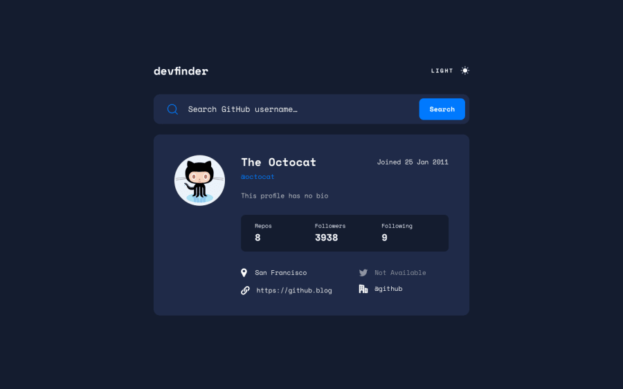
This looks very nice and works well. It's responsive down to very small screens, and looks good large too.
There are a few things in the HTML that could be improved. The input and button should be wrapped in a form. That way the user can submit by pressing the return key and not have to use the mouse to click the button.
The site heading should be in an
<h1>. That would then make the name an<h2>. The username and joining date shouldn't be headings at all. The username should probably be a link to the actual github profile url.The repos/follows/following could probably be a definition list. Or a regular unordered list with the labels as headings. But the numbers definitely shouldn't be headings. They're just numbers, and wouldn't make sense as chapter headings in a book.
It would maybe be nice if the twitter handle was also a link to the twitter profile.
Light/dark mode is notoriously difficult on a server generated framework like NextJS. Very well done for getting the user preferences correct on that. There is a brief flash of the light theme before it recognises that your preference is dark theme. If you wanted to really dig into why that happens, this blog post is good https://www.joshwcomeau.com/react/dark-mode/
Marked as helpful0@MikevPeerenPosted about 3 years agoHey @AlexKMarshall
Thanks for the feedback!!
Good mention about the form, I totally forgot. Also thanks about the definition list, I have never heard of it before!
Also the light dark flicker did not occur to me but thanks for pointing it out, I will try to fix that. Thanks for the Josh link.
I have added all your other suggestions, hope you like it more now :D
0
Please log in to post a comment
Log in with GitHubJoin our Discord community
Join thousands of Frontend Mentor community members taking the challenges, sharing resources, helping each other, and chatting about all things front-end!
Join our Discord
