


Stefan Mohenski• 30
@stefanelli990
Posted
I have a couple of suggestions: adding a little gap outside the card, especially on mobiles, and setting the maximum width to 384px, as specified in the design.
0
What are you most proud of, and what would you do differently next time?
I like how this came together. I've been learning NextJS + React + CSS + Tailwind all at the same time (BE + Mobile Dev), so the way of thinking in CSS/Tailwind is a little different.
What challenges did you encounter, and how did you overcome them?
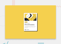
The main challenge I had was that in the design, the SVG as displayed was not the same as the asset provided. I never did figure out how to "crop" the SVG in HTML/CSS.
Also, the Tailwind Box Shadow API wasn't straightforward.
@stefanelli990
Posted
I have a couple of suggestions: adding a little gap outside the card, especially on mobiles, and setting the maximum width to 384px, as specified in the design.
Join thousands of Frontend Mentor community members taking the challenges, sharing resources, helping each other, and chatting about all things front-end!
Join our Discord