NextJS + Tailwind + Github Actions
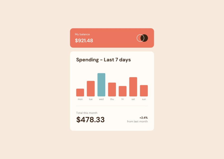
Design comparison
Solution retrospective
It is a cool project.
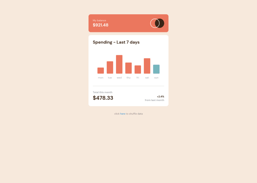
I got to realize using a a charts/viz library might be overkill for basic usage like this one and sometime doesn't take much more time to actually make it myself with CSS.
I allowed myself to use Github actions to deploy automatically on Github Pages my new commits and also added a small "shuffle" button which was not asked, just for testing purposes.
I'm also "pretty proud" but not at the same time of the following "hack" to display my chart a bit better
<div
    className={`${colorChart} hover:opacity-50 w-9 rounded-[3px]`}
    style={{height: ~~(data.amount * 2) }}>
</div>
Ah also, my version look at the current day to decide where to put the blue bar
See ya!
Community feedback
Please log in to post a comment
Log in with GitHubJoin our Discord community
Join thousands of Frontend Mentor community members taking the challenges, sharing resources, helping each other, and chatting about all things front-end!
Join our Discord
