Design comparison
Solution retrospective
- This was my very first project here in FEM but, somehow, forgot to post my solution...
Community feedback
- @grace-snowPosted about 1 year ago
Hi
I'm afraid this is inaccessible because you have set the body font size in pixels. It is essential to never do that. Use rem for font size, never px. More info
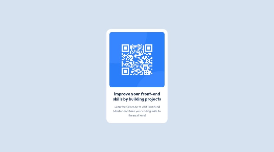
It's also important to label the image properly in this. Alt text is content, not code. This image is really important content so it must have a description that says what it is (QR code) and where it goes (to FrontendMentor.io)
Lastly, it is essential this component does not have height or width on it, especially not in px. The component should not have a height at all - that will make it break for users who change their font size or when editors change the text inside the card. And instead of a width, the component should only have a max-width in rem
1@grace-snowPosted about 1 year agoNot essential, but it's recommended to keep the html as simple as possible and not add extra nodes for no reason. There's no need for extra divs wrapping the image or text content in this
1@ttsoaresPosted about 1 year ago@grace-snow Thank you. Made all the changes. If it is not asking too much, could you offer any comment about my question at the solution:
https://www.frontendmentor.io/solutions/nextjs-tailwind-st-p4w_Qgx
0 - @marviecephasPosted about 1 year ago
Hi, marvie here!
I love your work. Can we connect :) [my github] (https://github.com/marviecephas)
0
Please log in to post a comment
Log in with GitHubJoin our Discord community
Join thousands of Frontend Mentor community members taking the challenges, sharing resources, helping each other, and chatting about all things front-end!
Join our Discord
