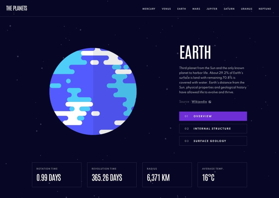
Design comparison
Solution retrospective
Hey everyone would love some feedback on items listed below if you have a minute or if you feel I could improve in any other area listed below please let me know ! :D
-
How is my file structure (is it clean, does it make sense)?
-
How did I do in composing my pages and components, (should things be broken down more, are the components themselves generic enough)?
-
My biggest issue I feel is managing data/state in the app, would really appreciate it if anyone has any better ideas could maybe point out places where I could use context more and prop drill less.
Community feedback
- @JeanMiesesPosted over 3 years ago
Man, I love the 3D effect when you click the surface of the planet. I read a bit of your code and even for a amateur like me, I was able to understand what each component does. The only thing I would change is the planet size for desktop. I feel it is a bit small... How did you get that 3D effect? Lol I wish I would have used something like that on my project.
Marked as helpful1@ScottGrunPosted over 3 years ago@JeanMieses Thanks ! I used the model-viewer library to display the models ! https://modelviewer.dev
0
Please log in to post a comment
Log in with GitHubJoin our Discord community
Join thousands of Frontend Mentor community members taking the challenges, sharing resources, helping each other, and chatting about all things front-end!
Join our Discord
