Submitted over 1 year ago
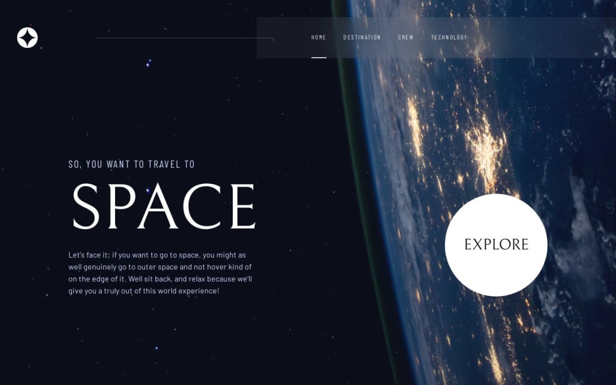
Next.JS responsive Space Tourism website
#next#tailwind-css
@Haaguitos
Design comparison
SolutionDesign
Solution retrospective
Hello! I would like some feedbacks, so thank you in advance.
- What could I do to improve the pages load? They are loading a bit slow.
- About the background images used on the pages, they seem a bit filtered on the figma files... What could I do to achieve something like that? I tried using
backdrop-filterbut it didn't work. - Following the second question, the crew/technology images seemed to have some kind of filter too, but I couldn't make it work too. What could I do to get this kind of filter?
- The buttons on the crew pages are a bit small, making a awful experience for smaller device users. Making the buttons bigger or putting the images on a automatic carousel wouldn't make it a better experience?
- Mobile sidebar just closes when clicking on the "X" button. Making a outside touch close it would be better too, right?
Any other feedbacks about the website would be great too!
Community feedback
Please log in to post a comment
Log in with GitHubJoin our Discord community
Join thousands of Frontend Mentor community members taking the challenges, sharing resources, helping each other, and chatting about all things front-end!
Join our Discord
