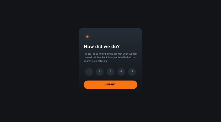
Next.js Interactive rating component
Design comparison
Solution retrospective
I am most proud of the radio input logic, state logic and making sure everything stayed accessible
What challenges did you encounter, and how did you overcome them?Having the radio controls be keyboard accessible and making sure that the state still updated with this was the biggest challenge. I eventually turned to ChatGPT which helped me figure out some of the finer details and streamlined some other functions in my code.
What specific areas of your project would you like help with?Any accessibility feedback is much appreciated!
Community feedback
- @grace-snowPosted 7 months ago
I'm a little confused by this code. If using radios correctly you shouldn't need any click events anywhere at all. Everything should be handled by the radios. That's important.
The radios must not be opacity 0 either. That makes them inaccessible. To visually hide them but keep them accessible use a visually-hidden (sr-only) css class.
You also need to make sure
- radios are grouped and labelled as a group. Usually that's done with fieldset and legend, but can also be done with role="radiogroup" and aria-labelledby.
- errors are announced to screen readers (wrapped in an aria-live region that is always present in the dom, not hidden or conditionally rendered).
- the new content is announced to screen readers (same aria-live method or you can move focus to the new content)
0
Please log in to post a comment
Log in with GitHubJoin our Discord community
Join thousands of Frontend Mentor community members taking the challenges, sharing resources, helping each other, and chatting about all things front-end!
Join our Discord
