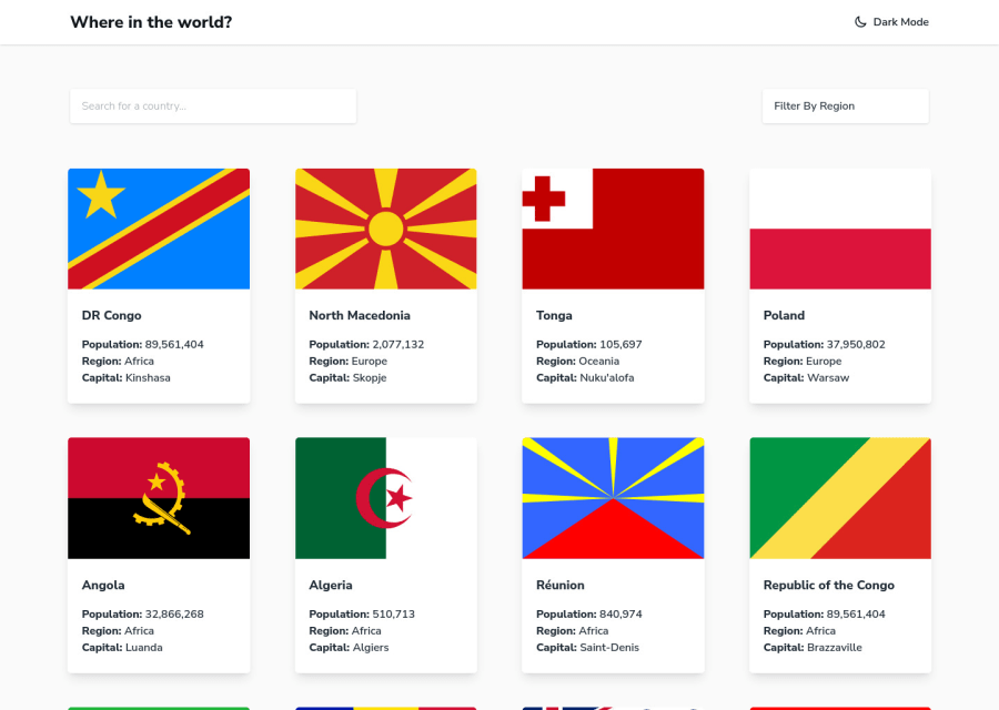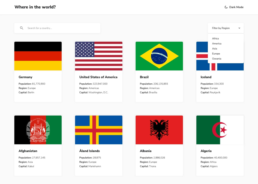
Design comparison
Community feedback
- @denieldenPosted almost 3 years ago
Hi Joe, I took some time to look at your solution and you did a great job!
Also I have some tips for improving your code:
- if I type a query that yields no results, there is no way to go back. Add a "go back" or reset query button
- on the homepage I suggest you to use css
gridinstead of flex for the container of card... initially I also used flex but I noticed that it created some problems with the flag images
Overall you did well :)
Hope this help and happy coding!
Marked as helpful0@joejcoxPosted almost 3 years ago@denielden Hey thanks for pointing that out, awesome! I did mean to add the search bar to no results as well but overlooked it and only added it to when there are suggestions. Will fix that today. I feel the back button isn't really required in this design at all as it has the same functionality as the browser back button. I have only added it on the country details pages because the design shows it.
With regards to flex I just prefer to use it, laziness on my part but are there any specific issues you've seen with it due to flex? The images are fine for me generally as I use the
object fitproperty and an aspect to show them.1@denieldenPosted almost 3 years ago@joejcox You are welcome! Yes, you are right... but on the one hand you would improve the ux especially for inexperienced users, for example, as soon as you type, I entered a
xreset query which, when clicked, takes you back to home.Flex is also fine... it's actually faster. I also used the
object fitproperty with flex but then I accidentally noticed that some cards stayed smaller... I implementedgridand in this use case I noticed that maybe it is more suitable. Still great job ;) Keep it up!0
Please log in to post a comment
Log in with GitHubJoin our Discord community
Join thousands of Frontend Mentor community members taking the challenges, sharing resources, helping each other, and chatting about all things front-end!
Join our Discord
