Next.js Conference Registration Platform
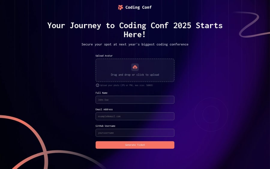
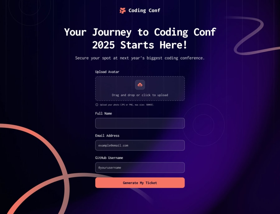
Design comparison
Solution retrospective
I'm most proud of delivering a fully functional solution that met all requirements within the tight time I had. If I were to do it again, I would adopt a mobile-first approach from the beginning. During development, I had to make several design adjustments to improve the mobile experience, which could have been avoided with better initial planning for different screen sizes.
What challenges did you encounter, and how did you overcome them?I encountered significant challenges with CSS blur effects and inset shadows, particularly when working with complex combinations of relative and absolute positioning. These issues were especially problematic in responsive layouts where elements needed to maintain proper relationships across different screen sizes. To overcome these challenges, I developed a systematic debugging approach. I would isolate problematic elements in the browser's developer tools and examine their position context, stacking order, and applied styles. For example, when dealing with blurry text in input placeholders, I discovered the issue was related to sub-pixel rendering caused by fractional positioning values. By ensuring all positioning values were whole numbers and adjusting the transform properties to handle animations instead of changing position values directly, I was able to eliminate the blur effect while maintaining the desired visual appearance. This methodical approach to debugging not only solved the immediate problems but also helped me establish best practices for our team to prevent similar issues in future projects.
Community feedback
Please log in to post a comment
Log in with GitHubJoin our Discord community
Join thousands of Frontend Mentor community members taking the challenges, sharing resources, helping each other, and chatting about all things front-end!
Join our Discord
