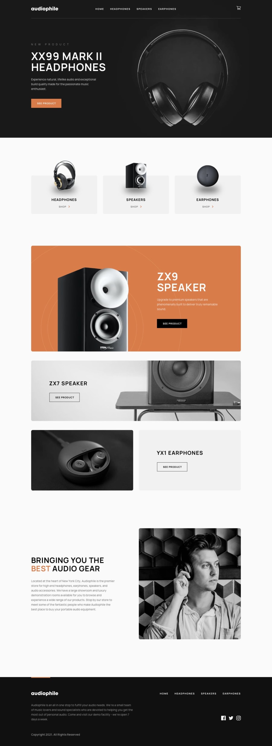
Next.js, Chakra UI, Redux Toolkit, React-Hook-Form, Atomic Design
Design comparison
Solution retrospective
First of all I wanted to appreciate how well the starter files for this project have been prepared. Responsive images, icons and especially big products.json file containing products data with paths to all images. It must have taken a lot of work, so for that big thanks to FM team (not sure who prepared that, would that be Matt or Em)
And this was such a great challenge. It's like everything I learned during these 5 months since I joined FM combined into this one big project: modals, custom radios, routing, form validation (checkout form was huge!) and especially creating reusable components. I also tried some completely new things for me like animations, inspired by Tediko and his awesome landing pages I added some on scroll animations on the home page.
As far as accesibility, new thing for me was 'Skip to content' link and aria-disabled attribute on button instead of 'disabled' for more inclusive disabled form button when cart is empty. For the full list of techniques and tools I used you can check out README.
One thing I couldn't figure out. In Firefox hero section is included in tabbing order for some reason. I don't see this issue in Chrome. Is that some kind of Firefox bug I'm not aware of, or something wrong with my code?
If you see anything wrong or that needs to be improved, please drop a comment
Community feedback
- @grace-snowPosted over 3 years ago
Really nice solution!
A few pointers
- use the aria-current="page" attribute to indicate the active page in navigation. You can use this as a styling hook as well if you like
- The focus issue is caused wherever you've included overflow-y hidden. If you set overflow to be hidden on all axis it fixes it. Not sure what's causing this though. It might be a Firefox bug - there was a similar one years ago from what I remember... Or it might be related to animations
- make sure all animations are OFF for people who prefer-reduced-motion
- wrap the footer navigation in a nav element, and make sure it has an aria-label like "footer"
- There's a functional error where you can add a minus number of products to cart
- There's a problem with your focus trap on the modal. Once in it, there is no way for a screenreader user to exit. It needs an explicit close/cancel button so people don't get trapped in there
- The other issue with the modal is that when you click the cart button with a screenreader, it immediately reads out everything in that modal in a really confusing manner
- The other screenreader issue is the multiple "See product" buttons. They need associating with the product name via something like aria-describedby.
That should be enough feedback for now :) Well done, you've worked hard on this and covered loads!!
Marked as helpful3 - @mattstuddertPosted over 3 years ago
So happy to hear you enjoyed the challenge, Michal! It was Em who exported everything and I prepared the
data.jsonfile 🙂Nice to see you choosing tools like React Hook Form and Redux Toolkit. We're in the process of refactoring our code to make use of Redux Toolkit at the moment!
What were your major takeaways from going through this project?
1@mbart13Posted over 3 years ago@mattstuddert Hi Matt, I wrote really long README this time to describe my process, but I would say the biggest takeaway was Chakra UI, which is my new favorite way of styling React applications (I mostly used Styled Components before). They provide many useful and accessible components, that you can customize by passing props.
Regarding Redux Toolkit, I was going to ask you during next community hangout session, if you are already using it on Frontend Mentor 🙂
0@mattstuddertPosted over 3 years ago@mbart13 that's really interesting about Chakra UI! I've not looked into it myself, so I'll take a look and see what it offers.
We haven't been using Redux Toolkit, but it's definitely to start using it. We'll be able to reduce our code quite significantly!
0 - @mbart13Posted over 3 years ago
fixed so far:
- changed validation mode to onBlur
- modal with empty cart will not have link to checkout
- user is not able to add negative quantity to cart
- added aria-current="page"
- fixed focus issue
1 - @szymon-99Posted over 3 years ago
hi, great job! One thing I would recommend to work on is form fields that require validation. Wrong format message should be displayed only after user finishes typing and the field is actually wrong. Its confusing when user starts typing and immediately there is a message that he's doing something wrong, also I would recommend to disable checkout until you add anything to cart. Besides that well done, also how do you disable scrolling when cart or checkout modals are shown?
1@mbart13Posted over 3 years ago@szymon-99 yeah, maybe validation 'onBlur' would be better than 'onChange' event
I'm adding overflow-y: hidden to body when modal is open
Thanks!
0
Please log in to post a comment
Log in with GitHubJoin our Discord community
Join thousands of Frontend Mentor community members taking the challenges, sharing resources, helping each other, and chatting about all things front-end!
Join our Discord
