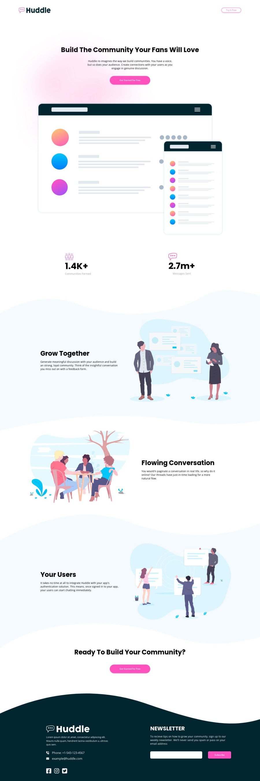
Design comparison
SolutionDesign
Solution retrospective
For me the difficult part is doing the layout in a decent manner, I use too much padding, margins, if anyone has any input on a good rule to follow regarding that, input would be much appreciated.
Community feedback
Please log in to post a comment
Log in with GitHubJoin our Discord community
Join thousands of Frontend Mentor community members taking the challenges, sharing resources, helping each other, and chatting about all things front-end!
Join our Discord
