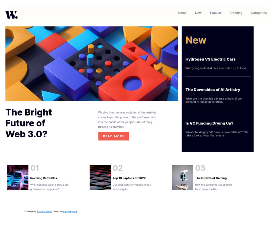
Design comparison
Solution retrospective
-How'd you guys find the project?
Community feedback
- @sulemaan7070Posted over 1 year ago
hey 😄pineapplegoose, congratulations on completing the challenge... here are a few tips to make your site better.
1.Regarding the mobile version the
imageis overflowing... causing the site to have a horizontal scroll make sure the image doesn't have any unnecessary height and width on the mobile version...2.When I open the mobile-menu the background color of the site is being changed.. instead of that add an overlay in the background to make it look more beautiful.
3.And make sure to center all the content (divs) on the mobile-version..
Hope that helps happy coding💯😄👍🏻
0 - @0xabdulkhaliqPosted over 1 year ago
Hello there 👋. Congratulations on successfully completing the challenge! 🎉
- I have other recommendations regarding your code that I believe will be of great interest to you.
HTML 🏷️:
- The solution generates accessibility error reports due to skipping
altattribute forimages
- Decorative
imagesdon’t add information to the content of a page.
- For example, the information provided by the image might already be given using adjacent text, or the image might be included to make the website more visually attractive.
- In these cases, a null (empty) alt text should be provided (
alt="")
- So that they can be ignored by assistive technologies, such as screen readers.
I hope you find this useful! 😄 Above all, the solution you submitted is great!
Happy coding!
0
Please log in to post a comment
Log in with GitHubJoin our Discord community
Join thousands of Frontend Mentor community members taking the challenges, sharing resources, helping each other, and chatting about all things front-end!
Join our Discord
