

Design comparison

Community feedback
- @khatri2002Posted 2 months ago
Hi @nzyokam!
The developed solution looks good! However, when focusing on the alignment of each news card, it deviates slightly from the design reference. Precise alignment is crucial in enhancing the component's overall visual appeal and consistency.
There are two main alignments to address:
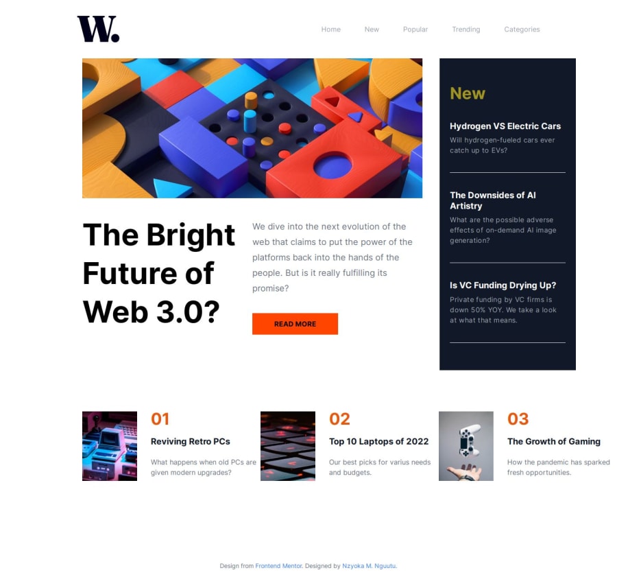
- The
Top 10 Laptops in 2024card should align exactly below theRead Morebutton. - The
The Growth of Gamingcard should align perfectly below theNewcard.
Currently, these alignments are not maintained.
You've used multiple flexboxes to create the layout. While flexbox works well for simpler one-dimensional layouts, in this case, relying solely on flexbox increases complexity and makes the layout harder to manage, especially when adjustments are required.
Why Use Grid Instead of Flexbox?
- Two-dimensional Layout Control: CSS Grid excels in managing both rows and columns simultaneously, making it easier to position elements in complex layouts like this.
- Explicit Alignment: Grid allows you to define precise areas for elements, ensuring that items align exactly as intended without relying on nested flexboxes.
- Simpler Maintenance: A grid-based layout is easier to read, update, and maintain compared to multiple nested flexbox containers.
By refactoring this layout using CSS Grid, you can achieve cleaner, more consistent alignment while making the code more scalable and easier to maintain.
Great effort so far! Keep refining! 🚀
0@nzyokamPosted 2 months ago@khatri2002 I'm surprised you managed to review all of that in just 9 minutes! I'm not familiar with Grid, which is why I didn't use it, but I'll make sure to learn it for future projects. Let me adjust the alignment of the elements. Thanks!
1 - The

Please log in to post a comment
Log in with GitHubJoin our Discord community
Join thousands of Frontend Mentor community members taking the challenges, sharing resources, helping each other, and chatting about all things front-end!
Join our Discord