

Design comparison

Solution retrospective
I'm proud to have learned Bootstrap.
What challenges did you encounter, and how did you overcome them?No
What specific areas of your project would you like help with?Please check my accessibility. Any advice?
Community feedback
- @khatri2002Posted 2 months ago
Hi @CasperTheChild!
The developed solution looks good!
Suggestions for Improvement:
1. Navigation Menu Wrapping Issue:
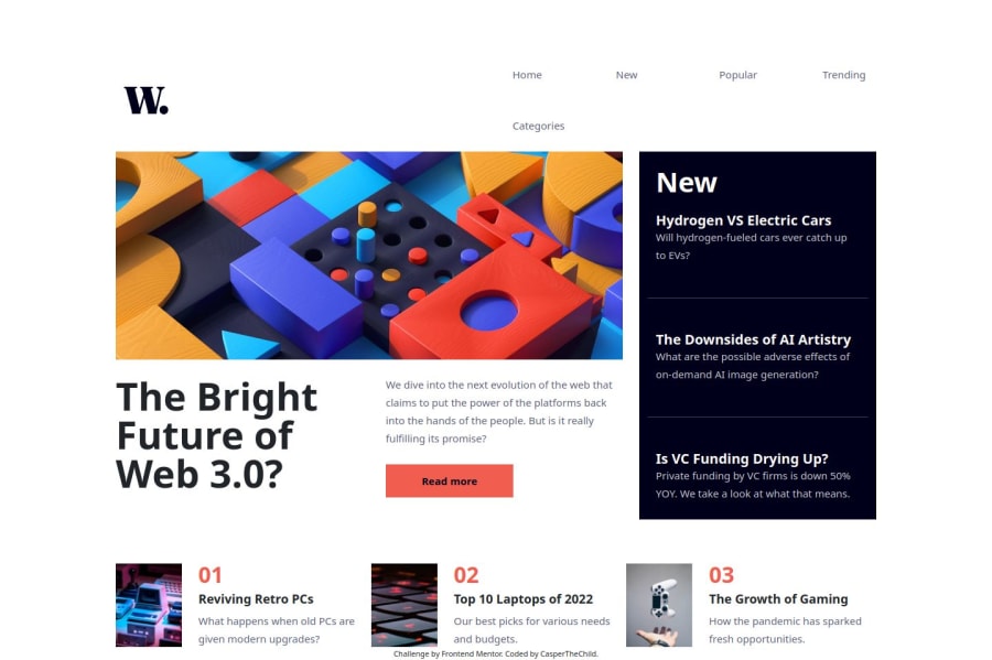
For smaller desktop devices (width: 1280px), the navigation menu appears to wrap, causing the last navigation item (Categories) to drop to a new line. This issue is evident in the Design Comparison snapshot.
You can restructure the navigation section by:
-
Using a Flexbox Layout:
- Create a parent flex container with two child elements:
- One for the logo.
- Another for the navigation items.
- Use
justify-content: space-between;to align the logo to the left and navigation items to the right.
- Create a parent flex container with two child elements:
-
Inner Flexbox for Navigation Items:
- Wrap the navigation items in a flex container and space them appropriately using
gap.
- Wrap the navigation items in a flex container and space them appropriately using
2. Semantic Structure of
navElement:Currently, all content (including news cards) is wrapped within a
navelement.Take Note: The
<nav>element is meant to wrap only the major navigation links of a page.- Move non-navigation content (like the news cards) outside the
<nav>element. - Use an appropriate semantic container like
<section>or<div>for the news section.
3. News Section Alignment Issues:
The precise alignment of news cards is crucial and is not maintained in the current solution.
Key Observations:
- The "Top 10 Laptops of 2022" card should be directly below the "Read More" button.
- The "The Growth of Gaming" card should align directly below the "New" card.
You’ve structured the news section using flexboxes and inner-flexboxes. While this approach works, it:
- Increases manual alignment efforts.
- Becomes harder to manage and scale.
Switch to a grid layout for the news section:
- Define a grid container with consistent rows and columns.
- Place each news card as a direct child of the grid container.
- Use grid gaps to ensure consistent spacing and precise alignment.
Great work so far! Keep it up! 🚀
Feel free to reach out to me anytime for guidance.
Marked as helpful1 -

Please log in to post a comment
Log in with GitHub
Join our Discord community
Join thousands of Frontend Mentor community members taking the challenges, sharing resources, helping each other, and chatting about all things front-end!
Join our Discord