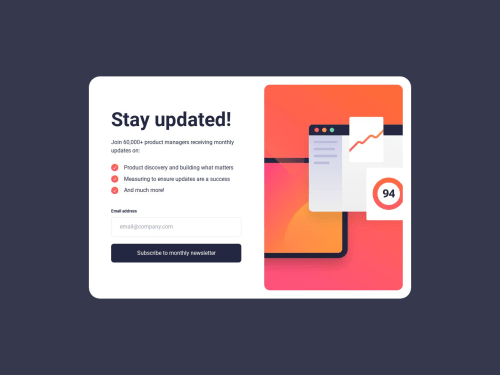
newsletter-sign-up-with-success-message-main | Tailwind Css | React

Solution retrospective
🚀 first project that is a little bit of pixel perfect
🚀 I just want to share that i just completed then Newsletter-sign-up-with-success-message-main , and my experience doing this challenge is a little bit challenging just like the hover effect of the image but i overcome it with the use of object-fit and scale..!
⚙️ Here the tools i used to complete this project
-
React Js.
-
Tailwind Css for styling.
-
Page insights scored 100% percent accessibility 🎯
-
Build this with mobile first approach.
-
formik for creating and handling of form
-
yup for validation schema
made with a lot of love
Feel free to suggest and give some feedback happy coding everyone !!!
Please log in to post a comment
Log in with GitHubCommunity feedback
No feedback yet. Be the first to give feedback on Jeje's solution.
Join our Discord community
Join thousands of Frontend Mentor community members taking the challenges, sharing resources, helping each other, and chatting about all things front-end!
Join our Discord