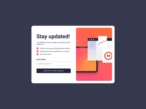
Submitted over 1 year agoA solution to the Newsletter sign-up form with success message challenge
newsletter-signupform

@ivara21
Solution retrospective
What specific areas of your project would you like help with?
Check it out , also leave some comments below for improvement or just your opinion , maybe there's a better way to the things i did. All will be appreciated thanks :)
Code
Loading...
Please log in to post a comment
Log in with GitHubCommunity feedback
No feedback yet. Be the first to give feedback on ivara21's solution.
Join our Discord community
Join thousands of Frontend Mentor community members taking the challenges, sharing resources, helping each other, and chatting about all things front-end!
Join our Discord